Re-imagining the watchlist experience
Our mission is to enable users to make informed and educated financial decisions. Users from around the world come to Yahoo Finance to consume our news and get updates on the stock market. Our goal is to provide these users with live, accurate content and with the utility they need to get informed.
My role
Yahoo Finance, one of the oldest and most successful verticals at Yahoo, has been established for over 20 years. Coming into the product, I was able to work with existing data and a consistent user base.
As one of the lead product designers, I was tasked to reimagine the entire watchlist experience in collaboration with two other product designers. I also worked alongside with a researcher, data scientist, two product managers, and the iOS and android engineering teams.
The new experience was launched in Q3 of 2017.
What value is there to redesign something that already works?
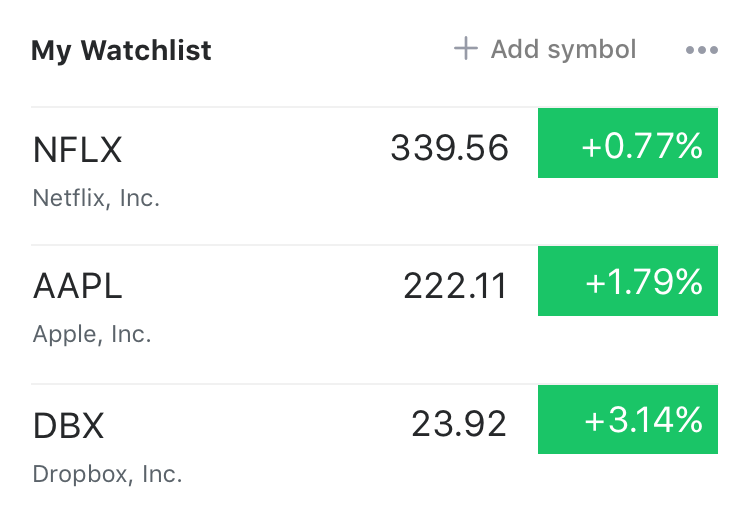
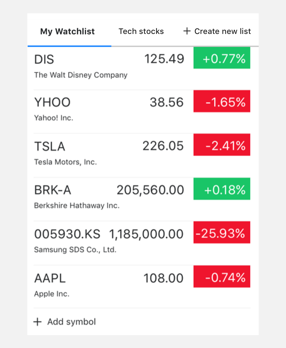
Within the iOS and android experiences, one of the biggest utilities that users saw value in was the ability to customize their watchlist. However, the experience only allowed users to have one watchlist. Research showed that users can have over 100 symbols in their watchlist.
When digging further into why users would have so many, we learned that users thought about their symbols in two ways:
So why is this a bad thing?
Users aren't getting their full value out of the experience because of two reasons:
The challenge
We see users following a lot of symbols with no way of organizing them.
The opportunity
We want to allow the creation of multiple watchlists. Based on this goal, we wanted the design to solve for 3 things
- Enable users to organize symbols into multiple lists
- Allow users to monitor multiple lists at a glance
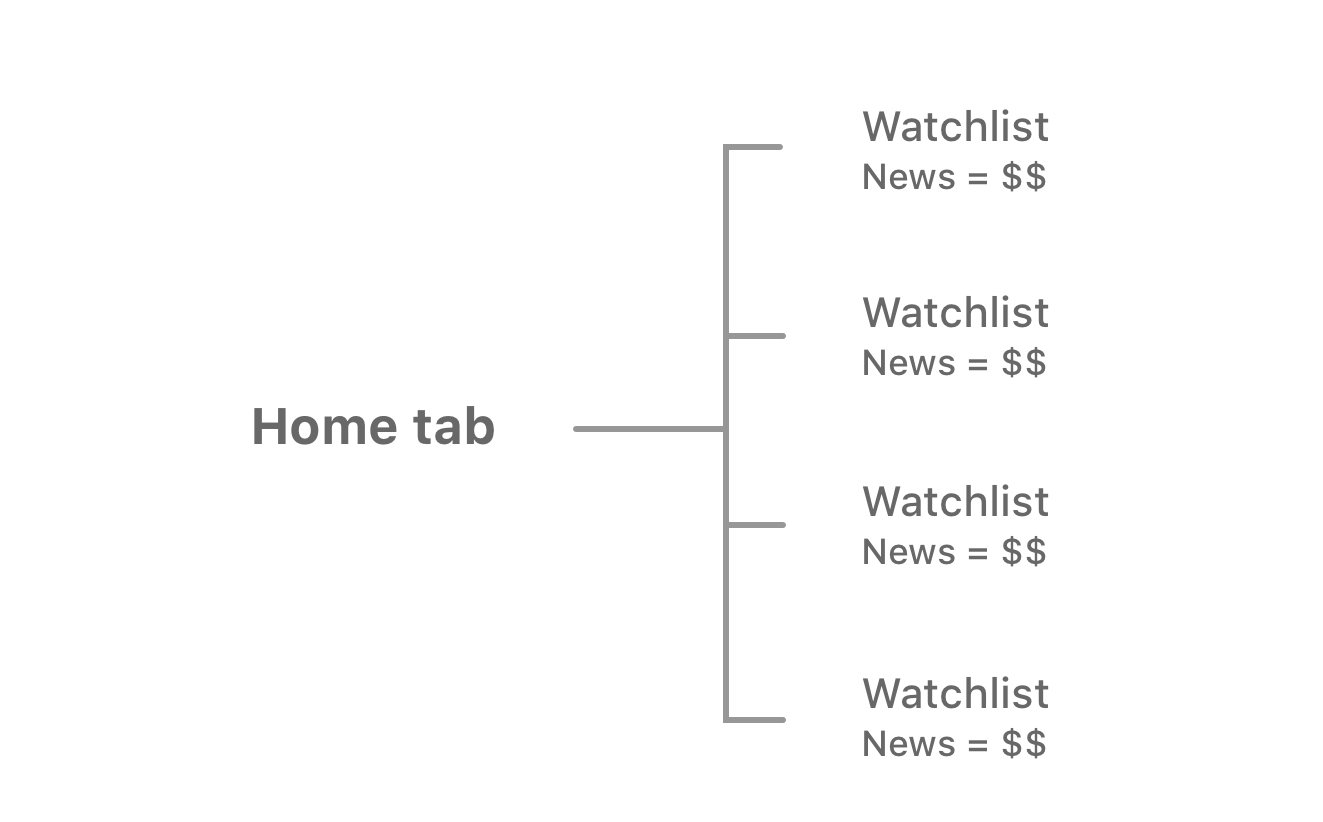
- Increase visibility of personalized news stream
Designing for multiple watchlists
Keeping to our goals of enabling users to create unlimited amount of lists, we had to first tackle how the user might discover this new functionality.
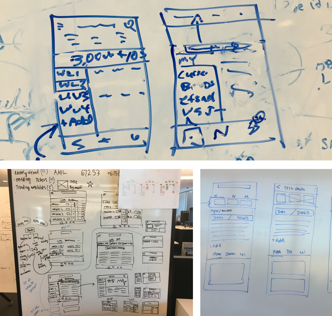
The entry point
Without distrupting the current experience, we didn't want to radically revamp the home experience which contained the watchlist. So we designed the experience to simply provide users an entry point into creating new lists using an arrow indicator.
We ran an A/B test with 4 buckets, including the control.
Things didn't go as expected
When we ran the bucket testing. We learned that they all performed poorly due to discoverability. We realized that if we really wanted to encourage users to organize their lists efficiently and provide better personalized news for the symbols they follow, we had to turn this into a much larger effort.
Back to the drawing board
I started exploring down the direction of visibly showing the ability to create new lists and surfacing their lists in a glance on the Home screen directly.
Research insights
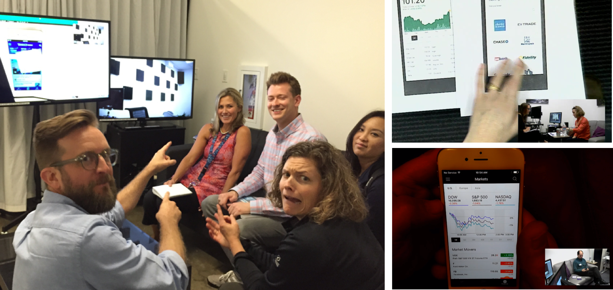
We spoke with over 20 participants in the research labs to test in detail how users can intuitively create more watchlists and organize their symbols.
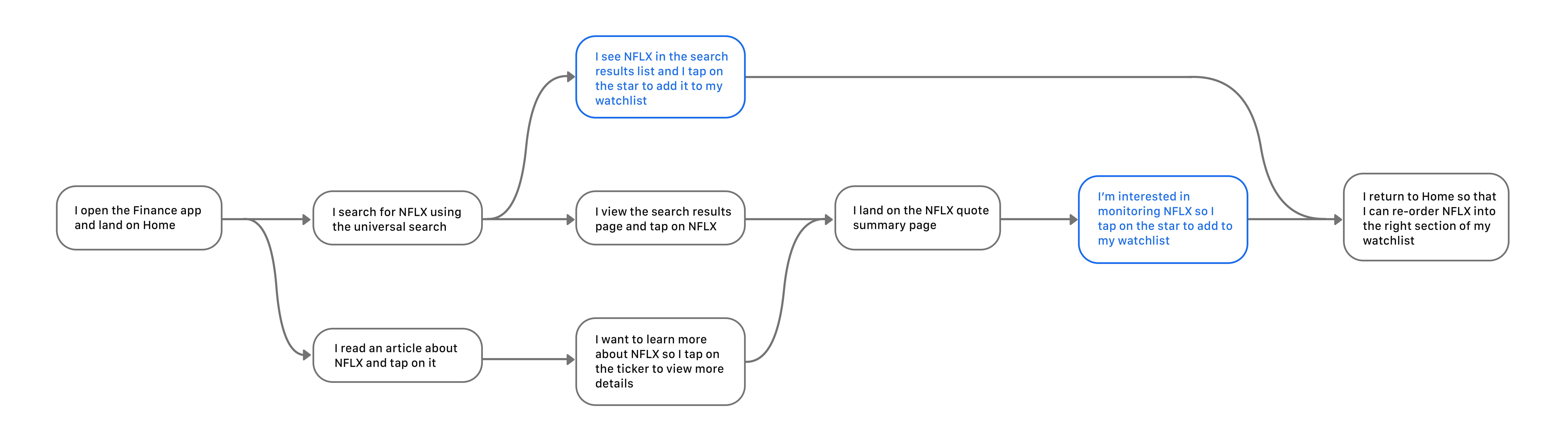
How users were adding symbols today
We wanted to understand specifically when and where users decided to follow a symbol. This would help us to understand when we would surface the creation of lists.
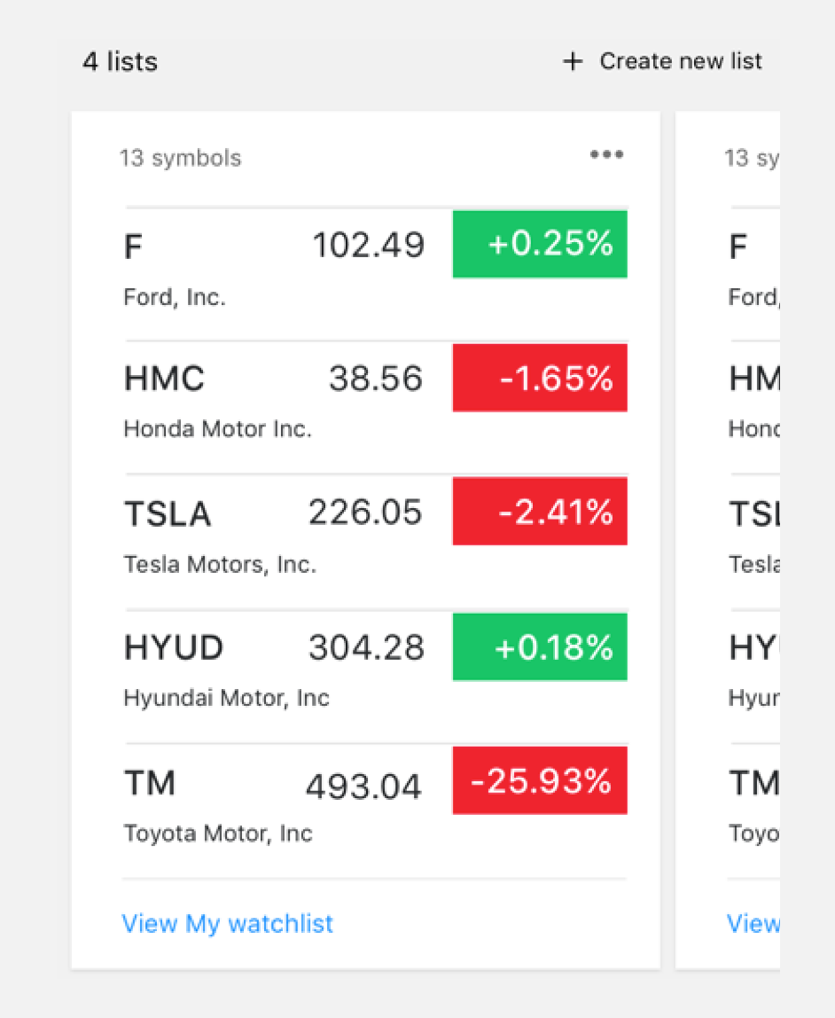
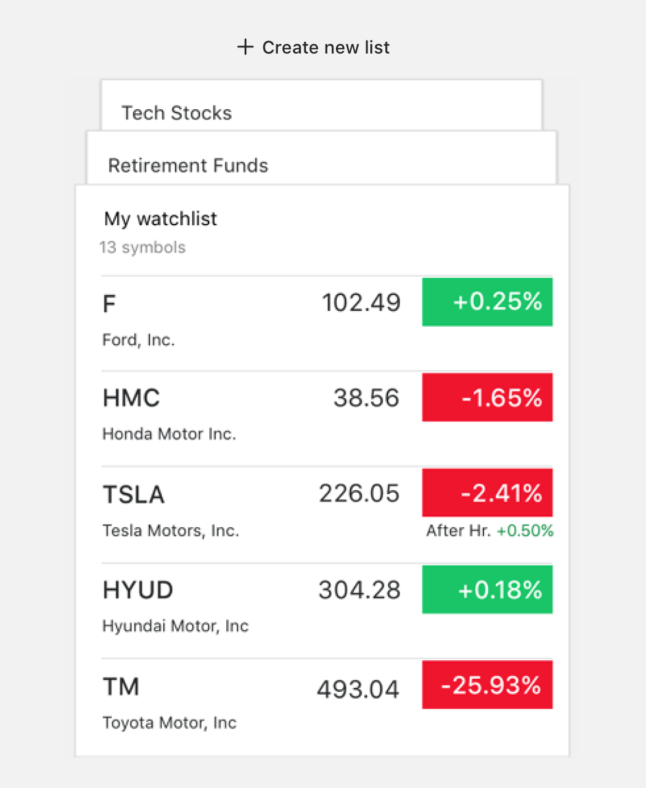
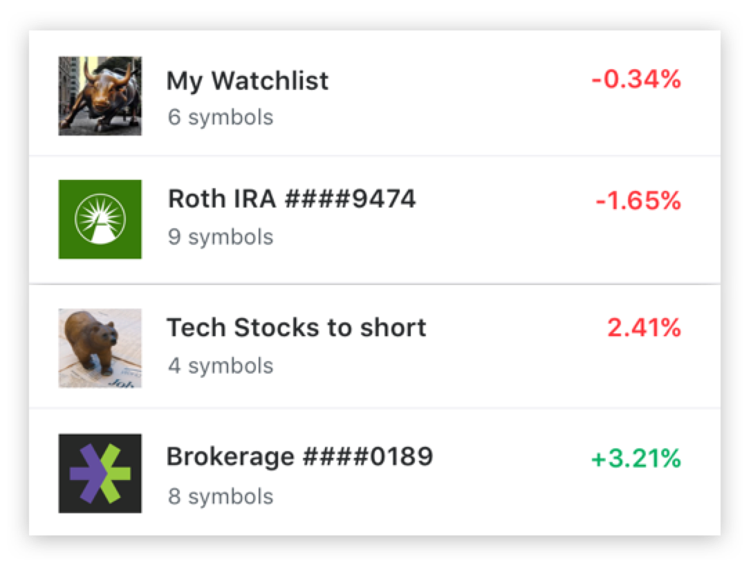
The list of lists
We distilled the design direction into what we would ultimately call the list of lists.
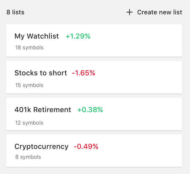
Surfacing the right data
To bring impact and value through the list of lists, it all came down to the data we surface in this experience. Because we were exposing a level up, the data that users cared about at the symbol level was completely different than from the list level.
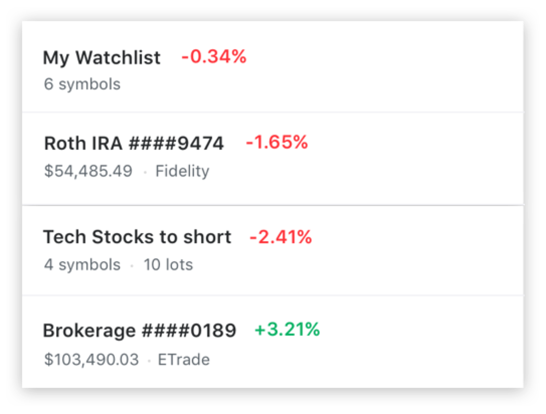
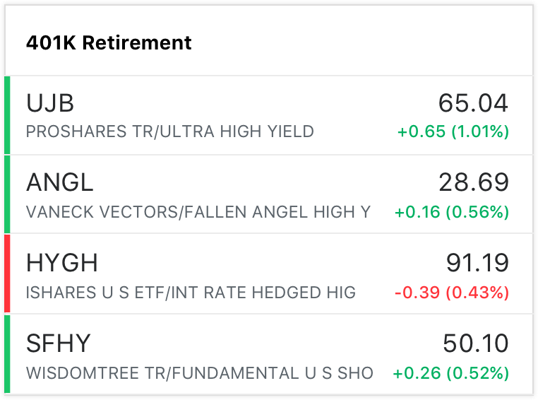
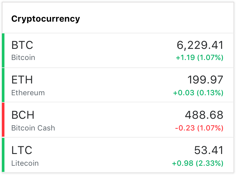
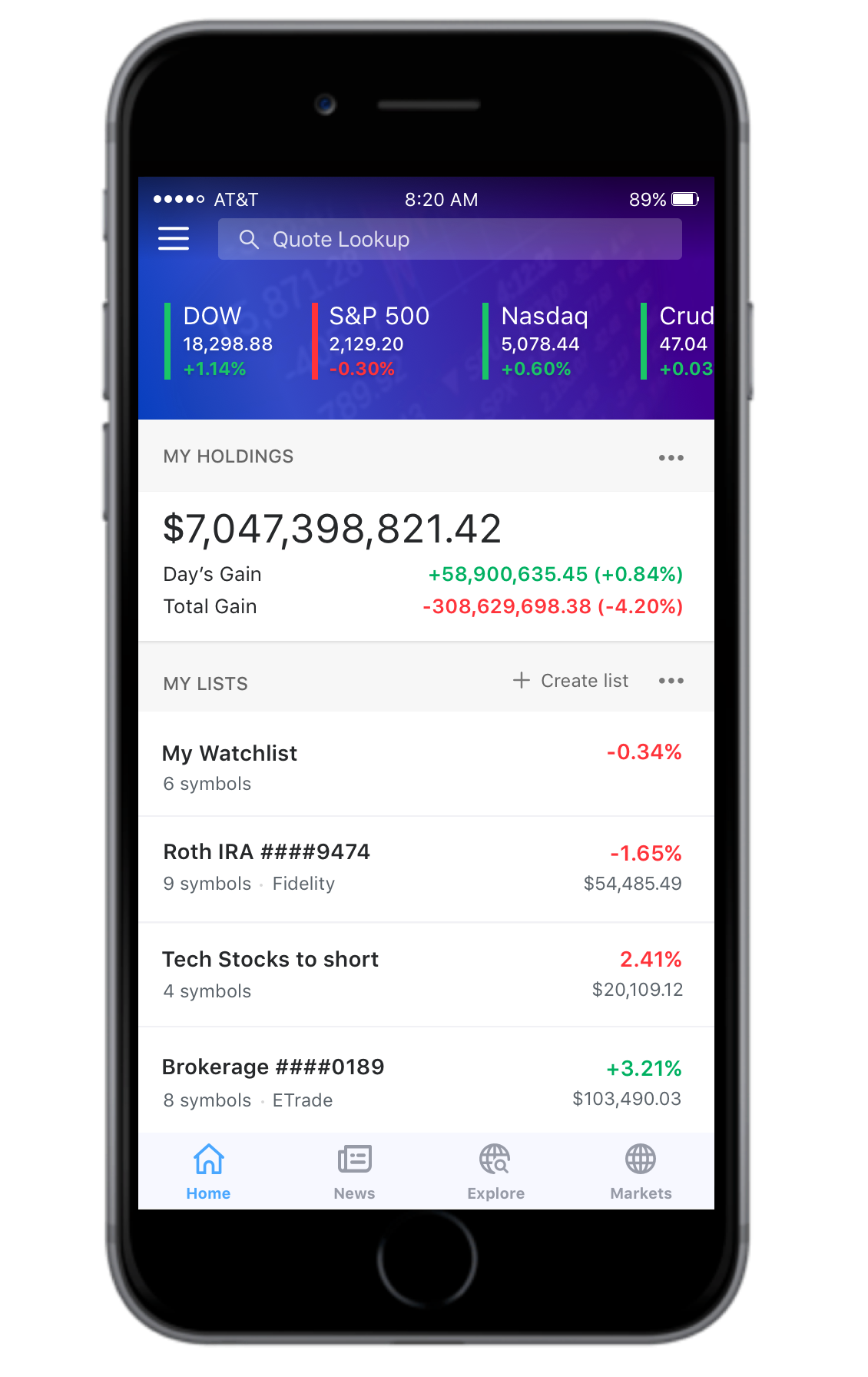
The performance module
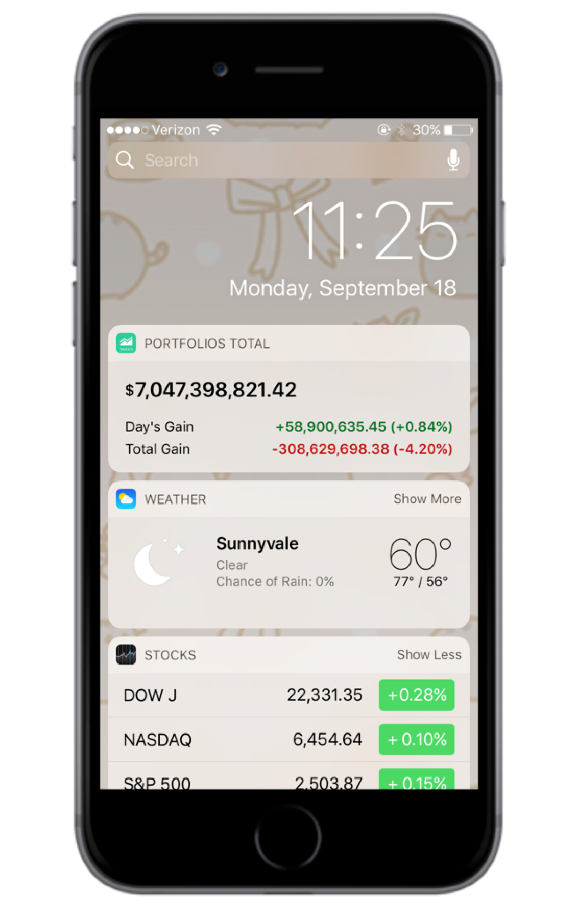
Because we're introducing a redesigned home tab that would surface the list of lists, it was also important to provide users the ability to view their total performance data for all their lists.
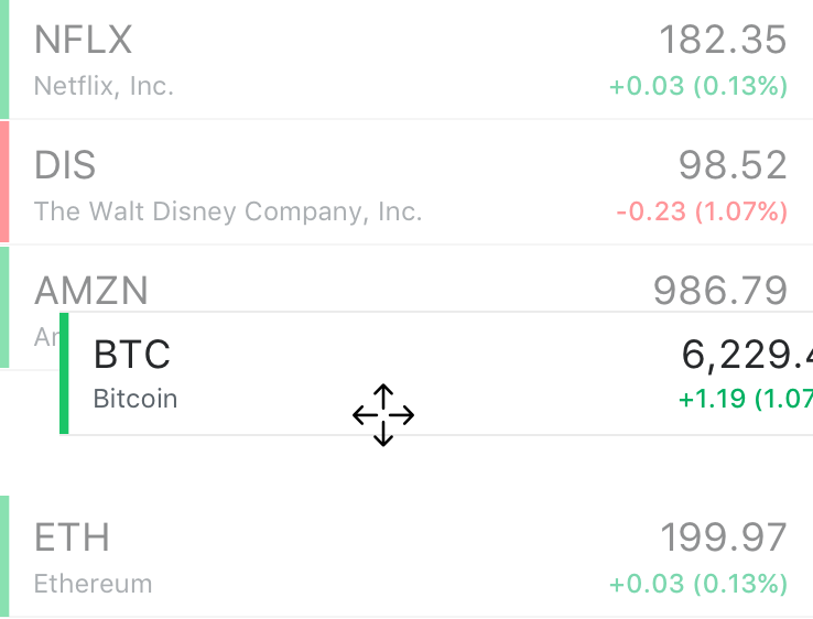
"But I still want to see my symbols easily"
Unlike the original watchlist experience, with the new list of lists approach, users now felt it was troublesome to now tap into each list to see symbols. They also couldn't see the list immediately when launching the app or keep it open by default.
Introducing the accordion
In order to bring the best of both worlds, allowing users to organize and view their lists easily but without sacrificing the value of the old watchlist experience, I proposed to integrate the accordion interaction model into the user experience.
Designing for scale
Once we ended up with the list of lists, I also had to consider scaling this for iPad users, as a lot of Yahoo Finance users commonly use iPad as well. I explored using similiar list of lists concept for the phone to the iPad and also considered completely redesigning the experience differently to utilize the real estate more.
The accordion couldn't scale
When I tried to apply the same design interaction model to the iPad, it broke. With the larger real estate of the iPad, the accordion took up too much space.
Let's build a custom UI for the iPad
I went back to the drawing board to see if I could better utilize the space specifically for iPad users. I took inspiration from the iMessage Apple app and applied that principle to this new design direction. iPad users are already familiar with the left side navigation, why not use this to enable users to easily navigate between their lists?
The launch
We launched the new watchlist experience in Q3 of 2017. Revenue increased by 27% in the first month. The more watchlists people created, the more personalized news was created. And the more news was created, the more ads were surfaced.