A new way to navigate the finance space
Everyday, people come to Yahoo Finance to get the latest updates happening within the stock market and more. Our job is to provide these users the information they need to make important financial decisions, no matter what level of financial status they have.
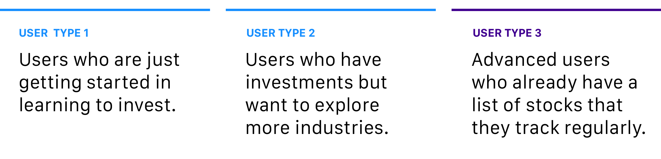
Historically, Yahoo Finance has always had extremely professional and skilled users. But for those of who are more novice in this space, they want to discover new things but don't know where to start.
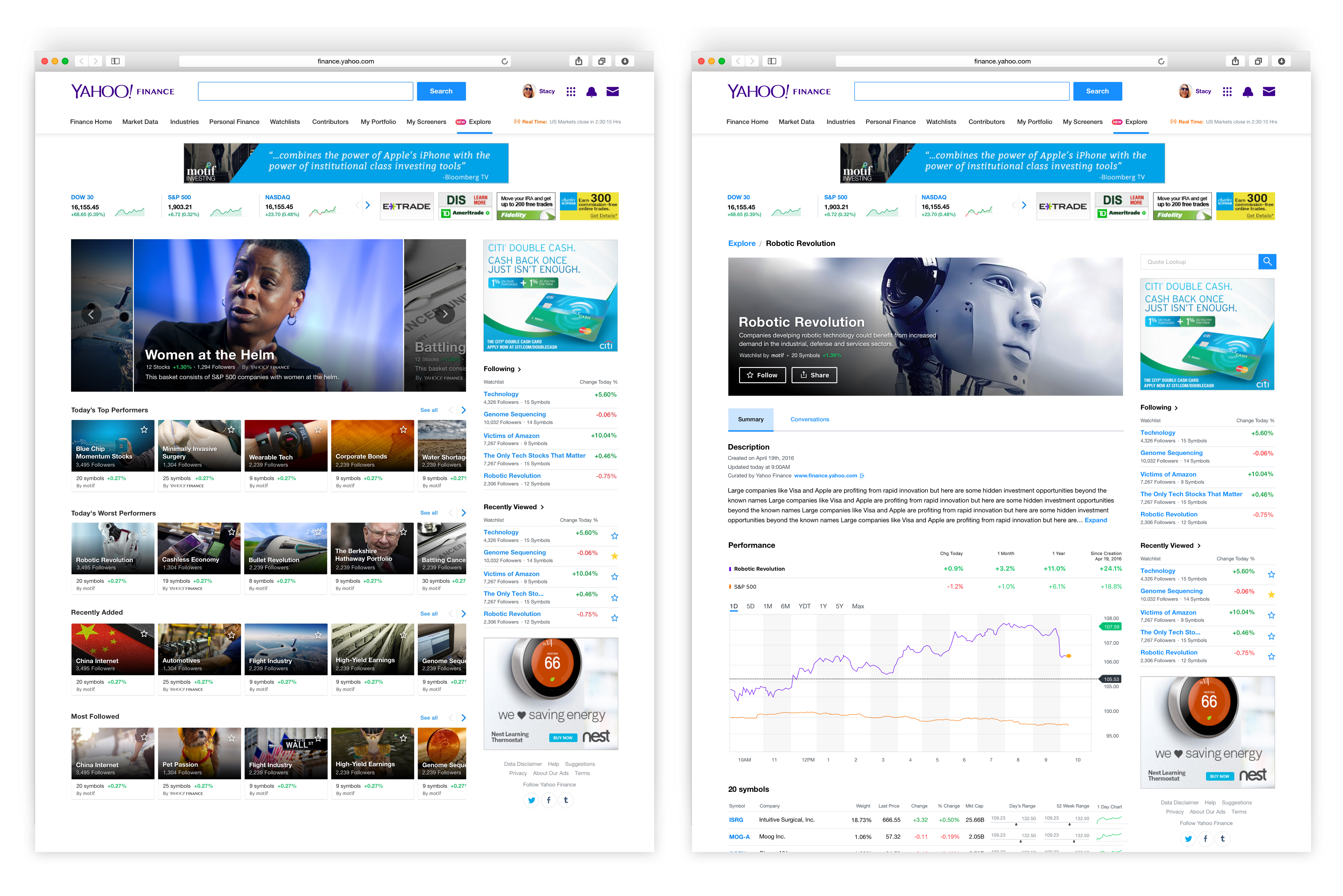
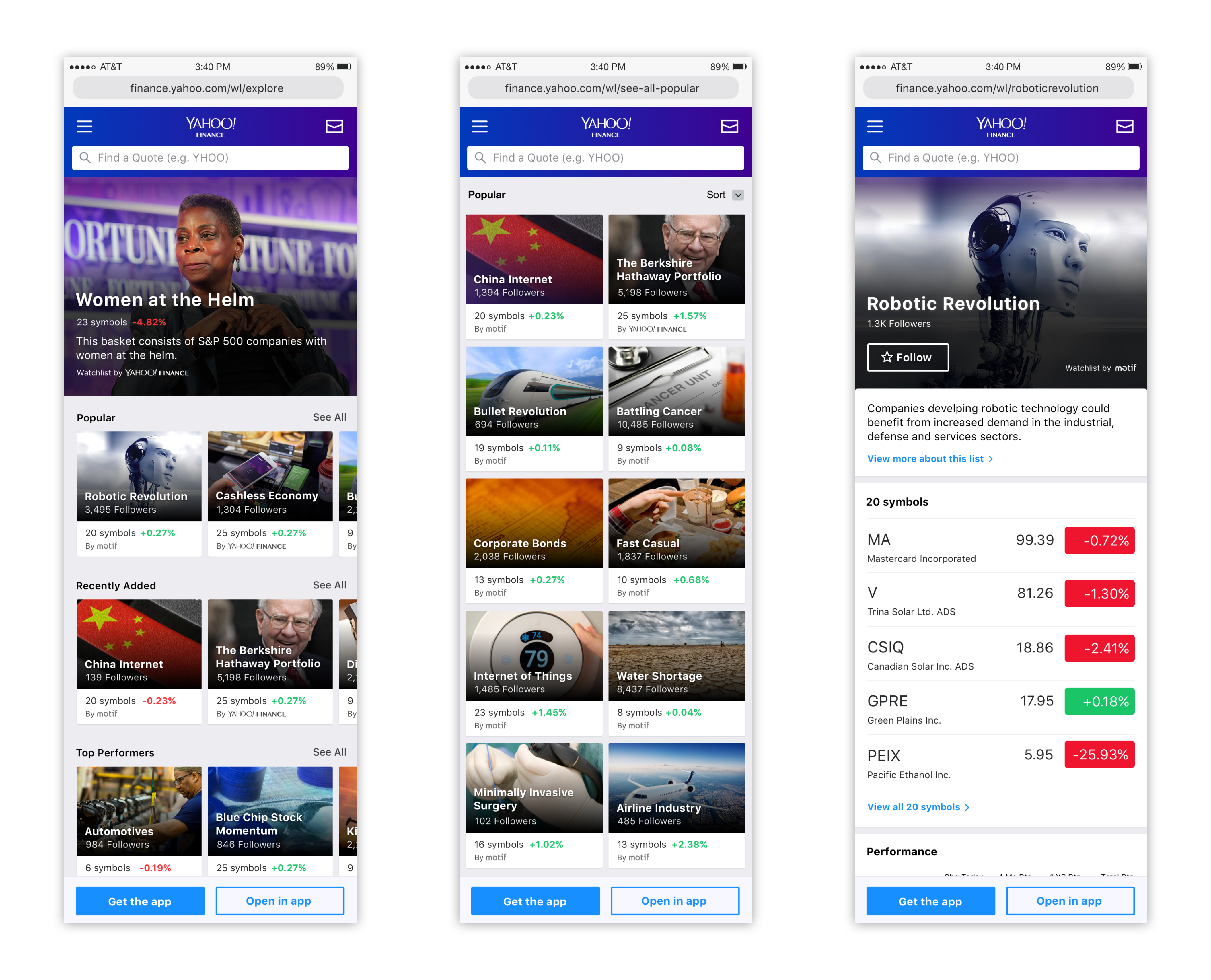
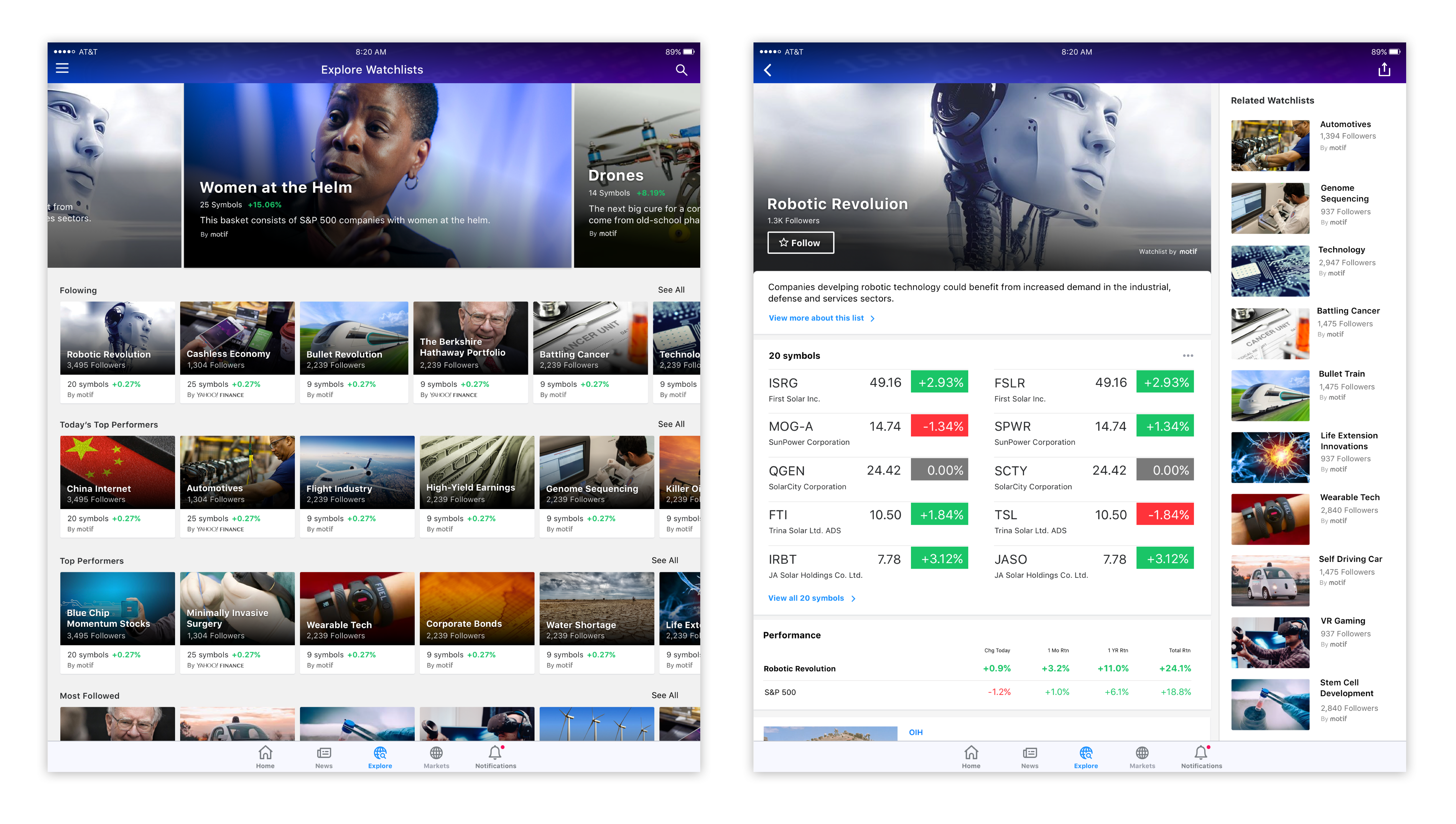
The new "Explore" tab was launched in Q2 of 2017. "The Berkshire Hathaway Portfolio" became our most popular followed watchlist.
Who exactly are we targeting?
We wanted to provide a way for users type 1 and 2 to discover new companies, industries, and sectors. Because today, most financial websites normally assume that the user already knows what to search for, for those who don't know where to start, it's difficult to discover or browse through new spaces.
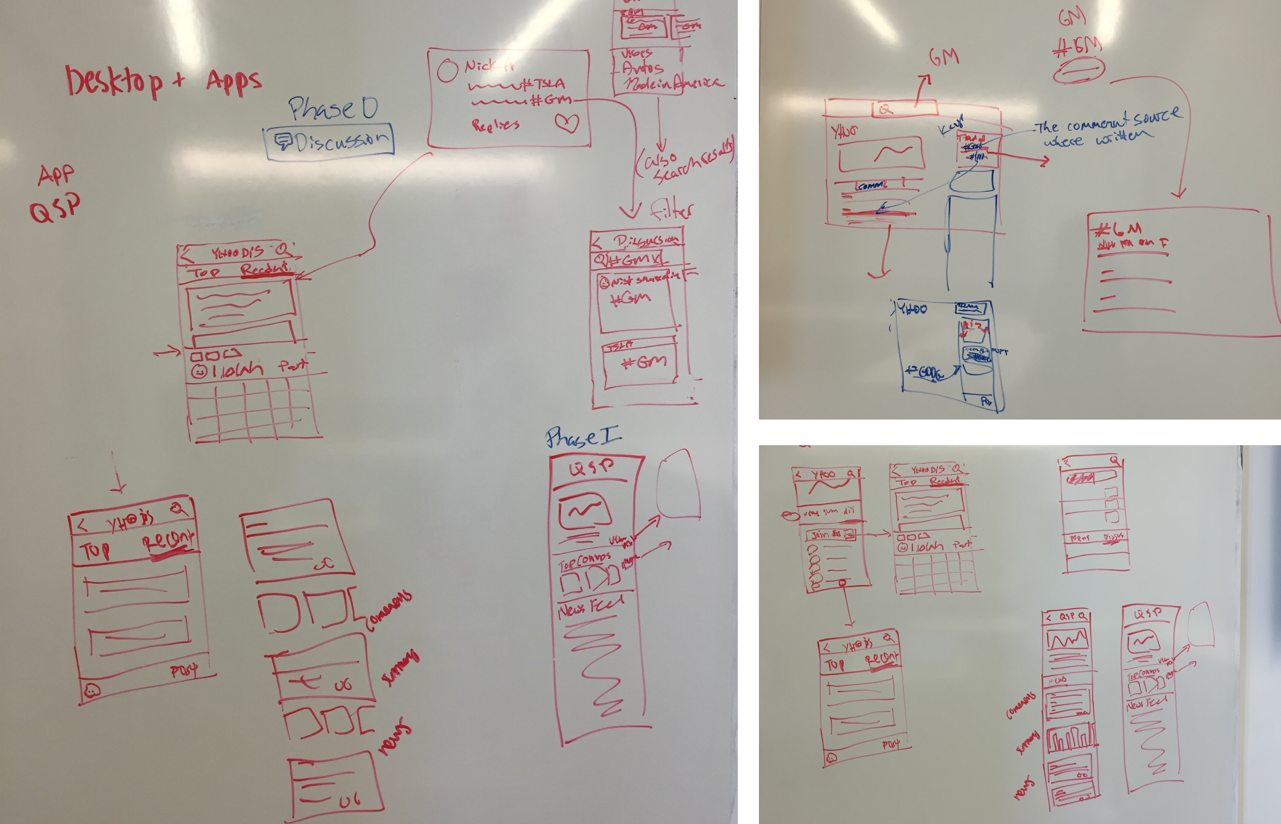
How might a user discover this new feature?
We brainstormed many different ways for users to access more information about companies they don't know and what they might do with that data. We tapped into search, the news stream, article pages, quote summary pages, and anywhere where user might already be engaged in content.
Orienting around curated watchlists
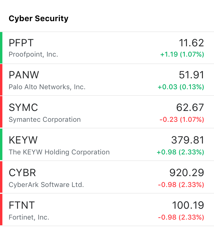
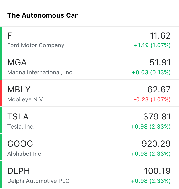
Everything in the finance world is about trading, monitoring, following, and getting informed. Users are already creating their own watchlists based on symbols they already know they are interested in. So what if we provide editorially curated watchlists based on industries and topics?
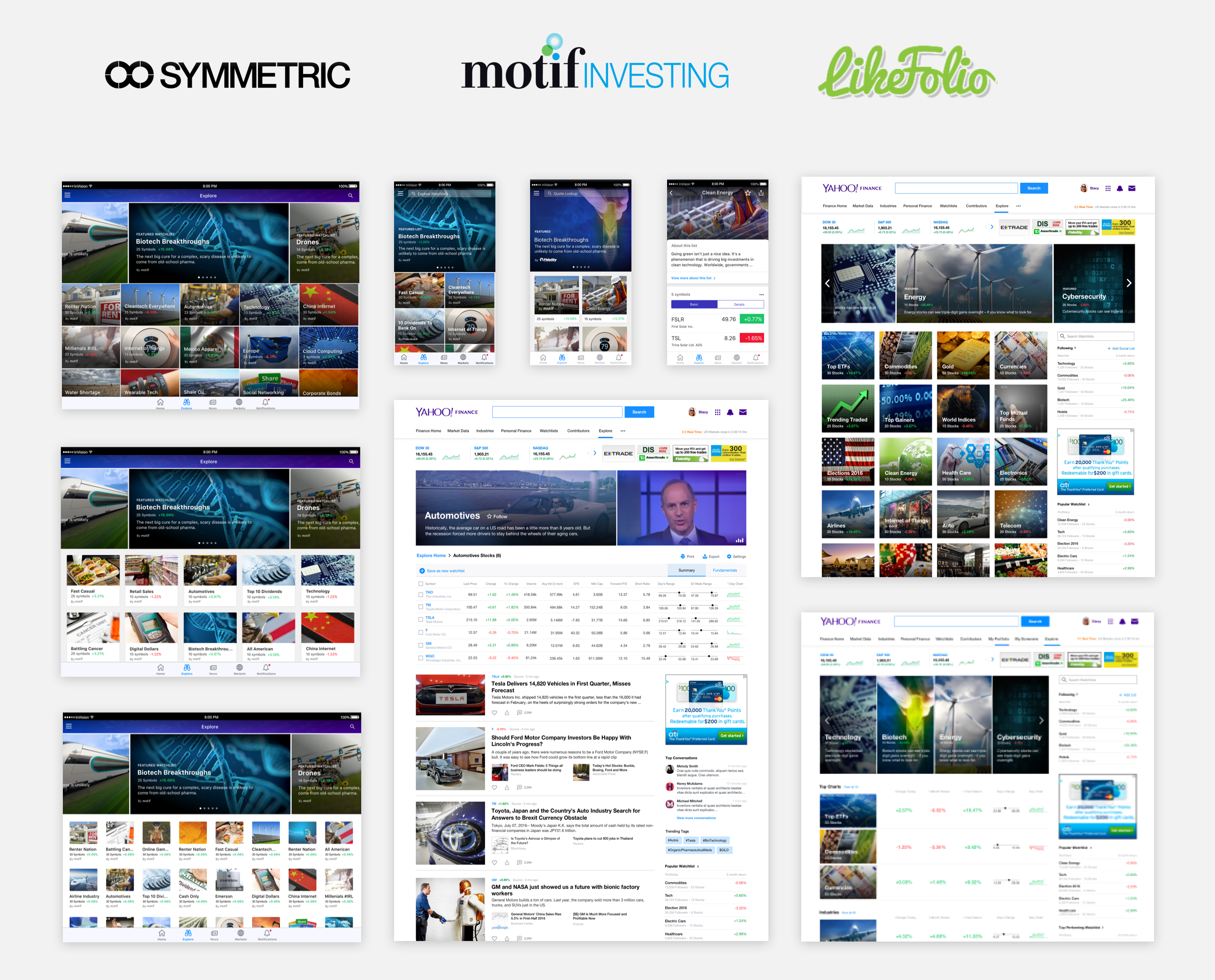
Partnering with financial companies
We partnered with many companies to provide curated industry-based lists and we explored in different card format grids for easy visual scanning.
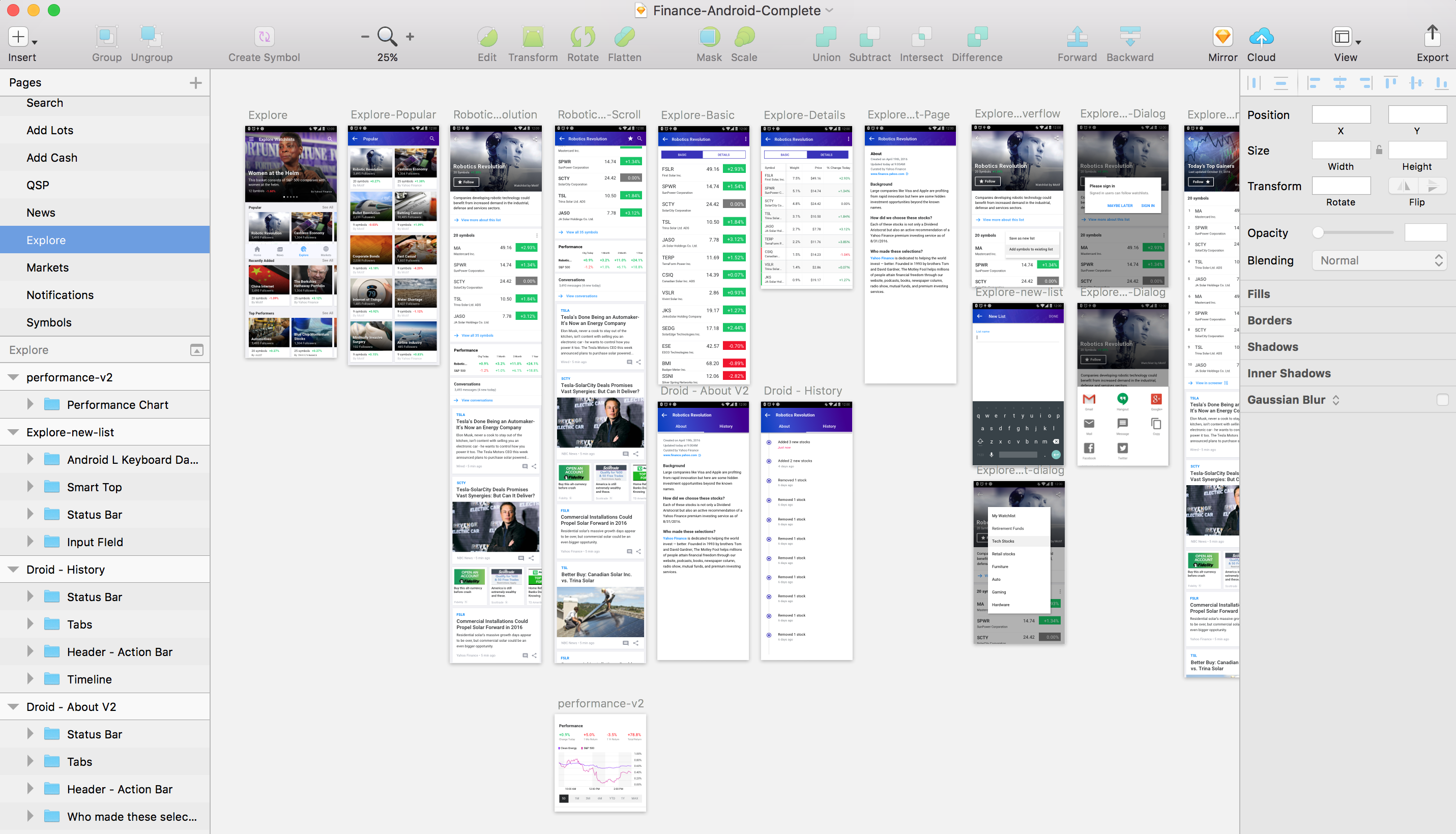
Collaborating with engineering
Documenting each unique use case and user flow.
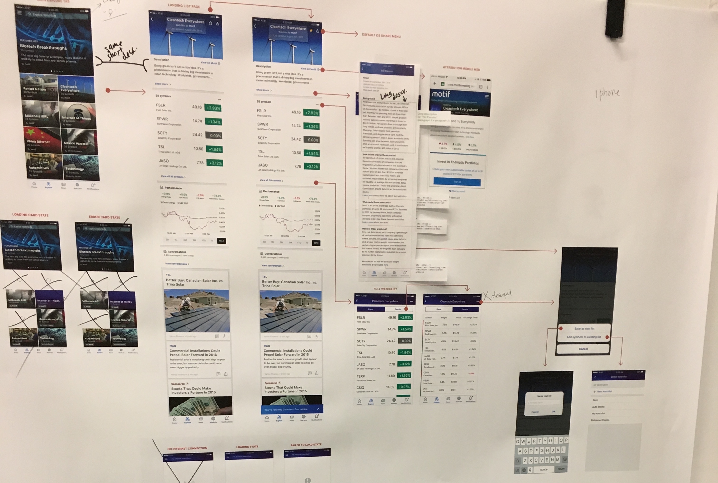
User Research & Iterating
Problem: The full bleed grid system ended up being too difficult for users to parse.
Solution: We did a non-full bleed card grid and made the carousel rotate every 4 secs to help users focus their eyes.
Problem: Users had a hard time navigating and finding lists they were interested in.
Solution: We organized them by popularity, sectors, and industries.
Feature Request: Users wanted to be able to add stocks to their own lists
Solution: We gave them ability to add stocks to existing or new list.
Feature Request: Users wanted to be able to compare the watchlist to market performance.
Solution: We implemented mini chart and full screen charts.
Feature Request: Users wanted more information on which stocks change daily.
Solution: We added a history/timeline view of every stock update.
Mobile Web
iPad
Desktop