
The beginning of a dropbox ecosystem
Today, the user perception of Dropbox is seen as nothing more than file storage. But there's a huge amount of activity and collaboration that happens around a file every day. How might we make Dropbox a more collaborative place that allows users to focus on work that matters?
My role
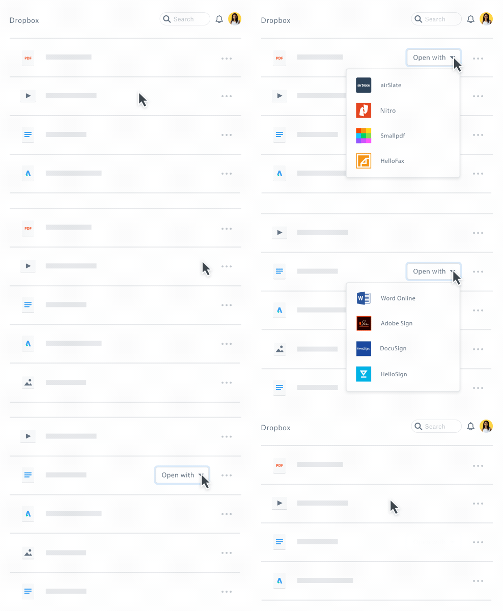
I joined a new team at Dropbox called Ecosystems in 2017. I was tasked to focus through the lens of enabling Dropbox to connect with other tools to help users get their best work done. The question we ask ourselves is how might Dropbox work more seamlessly with other tools?
Starting from what we know
In the beginning, we didn't really have a process or a framework for how to tackle this problem. So we started off by digging into the types of files users are storing on Dropbox today.
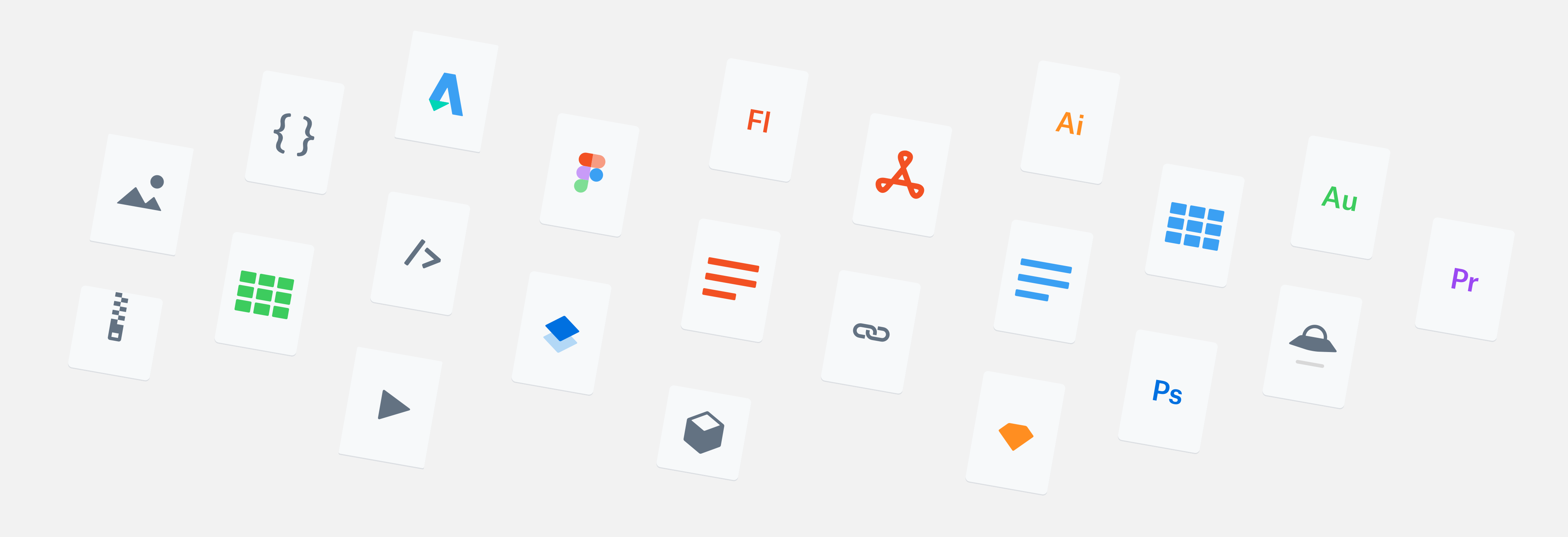
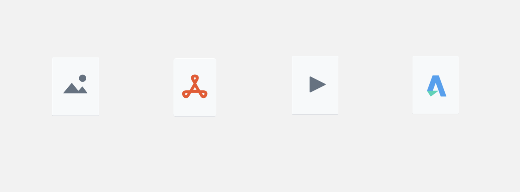
From there, we learned 4 common file types that were being stored on Dropbox in high volumes. There was especially a huge volume of PDFs being stored on Dropbox with 49% weekly active edits!
The .pdf file
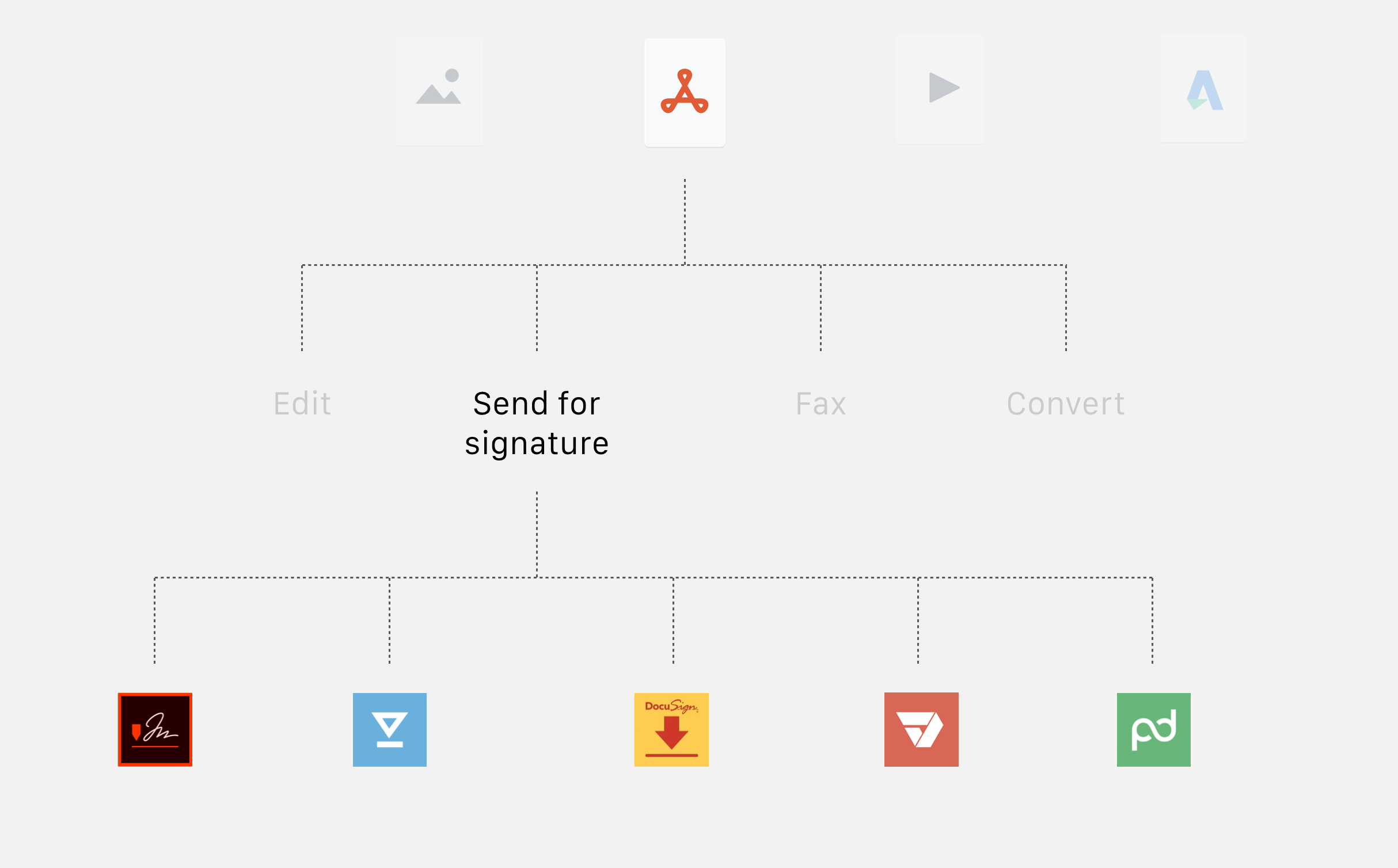
Focusing on the PDF file type, the most commonly used file extension capable of being opened in a large number of applications, we decided to look deeper into the type of workflows that users commonly go through.
Through various competitive analysis and partner research streams, we identified four common workflows.
- Edit
- Send for signature
- Fax
- Convert
Send for signature
Honing in on the e-signature use case, we looked into the types of tools users were using to accomplish this workflow and identified the top 5 apps people use. This included DocuSign, Adobe Sign, HelloSign, and more.
The challenge and the opportunity
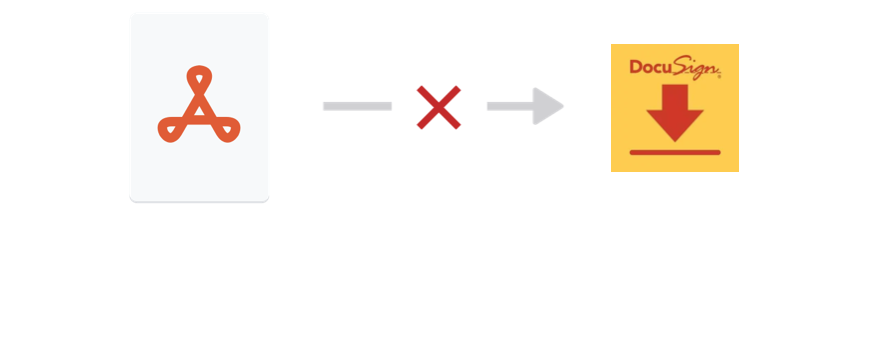
After learning about the tools users commonly use for e-signature, we wondered what a typical workflow looked like. Because today, users aren't able to bring files from Dropbox directly into any cloud tool such as DocuSign.com like they would when opening a file to a desktop app. So we set our product goal to design a way to surface cloud tools on the Dropbox platform to allow users to kick-off their workflows starting from their file to mimic the capability users can do when opening in desktop apps.
Research insights
Before we could understand what the design should be solving for, we had to first understand the user's full end-to-end journey to inform the experience we design for them. We interviewed users across different job functions and identified common themes and pain points that were being surfaced throughout different workflows when users use Dropbox and cloud tools. And one of the biggest questions and risk we wanted to validate was whether the user initiated their workflow from the file first or the tool first.
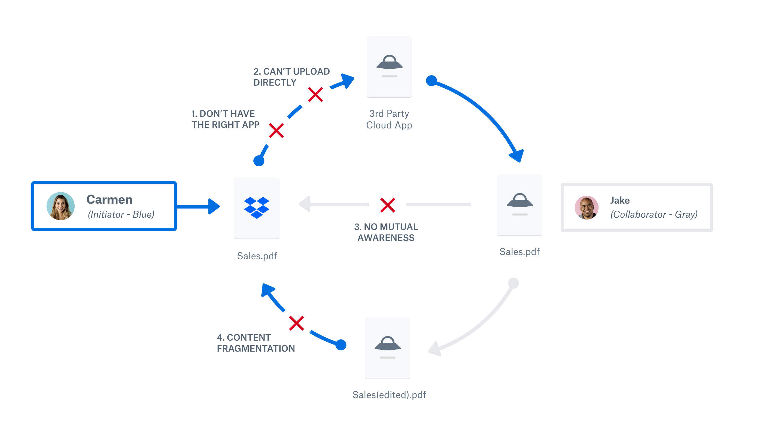
I illustrated the four pain points in a high-level diagram to capture where the struggles commonly surfaced throughout a user's workflow.
- Not knowing the right app to accomplish a task
- Can't start workflows from where files are managed
- Lack of mutual awareness during collaboration
- Content gets siloed in different cloud tools
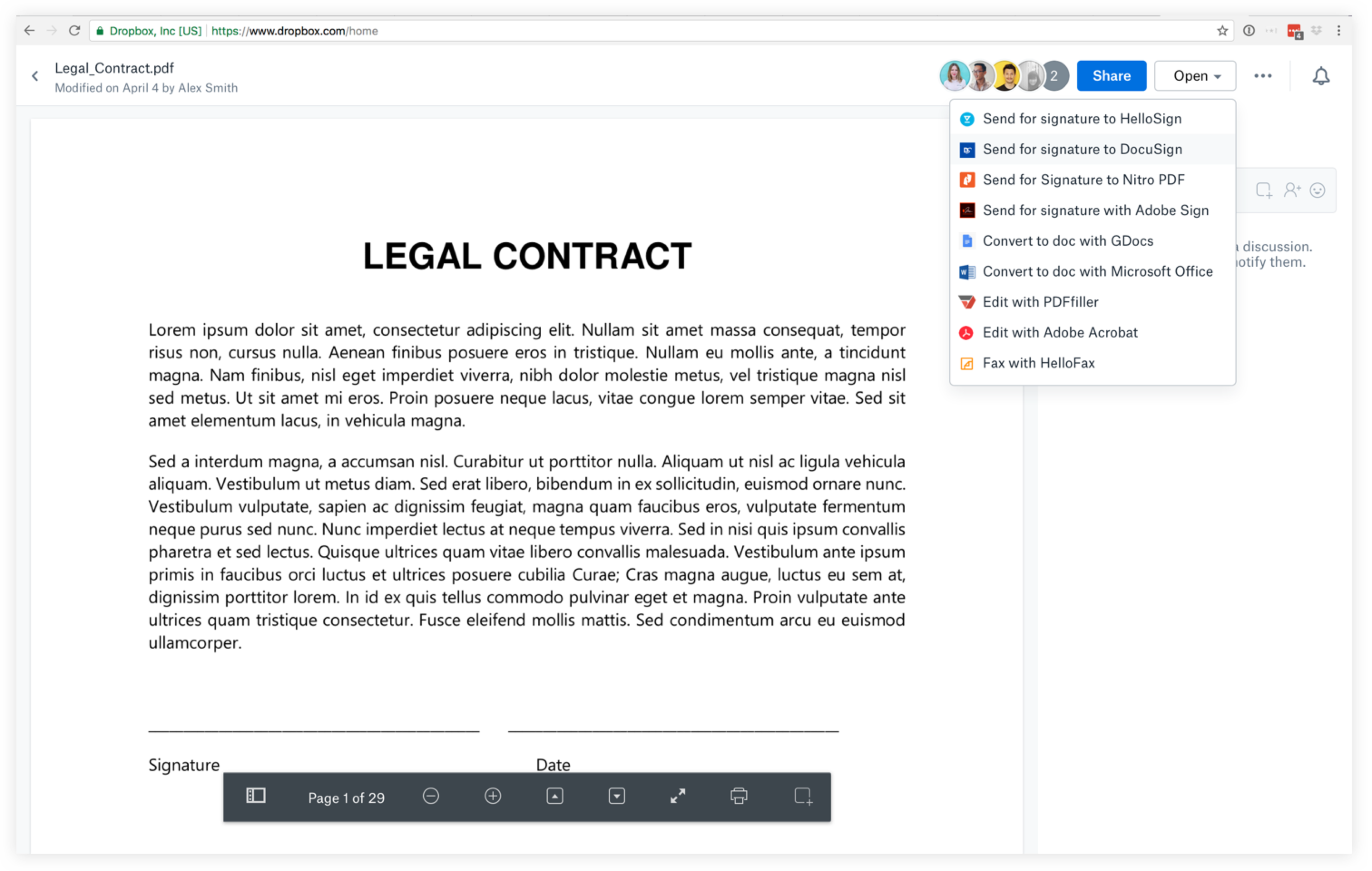
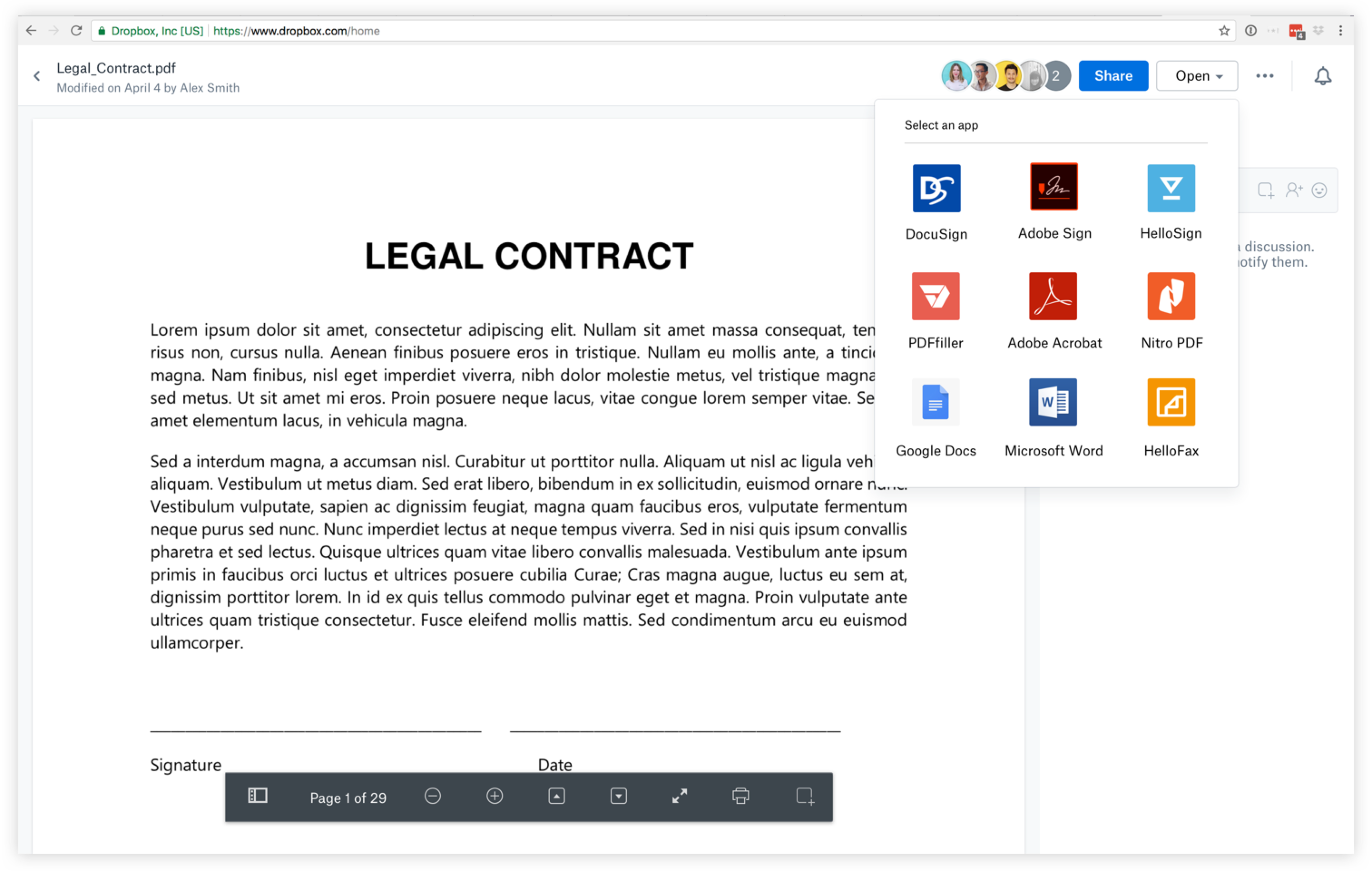
Designing to surface 3rd party tools on Dropbox
We were able to validate that users do have a need to kickoff workflows from their files but because they aren't able to, they have to find inefficient workarounds that take extra steps to accomplish this.
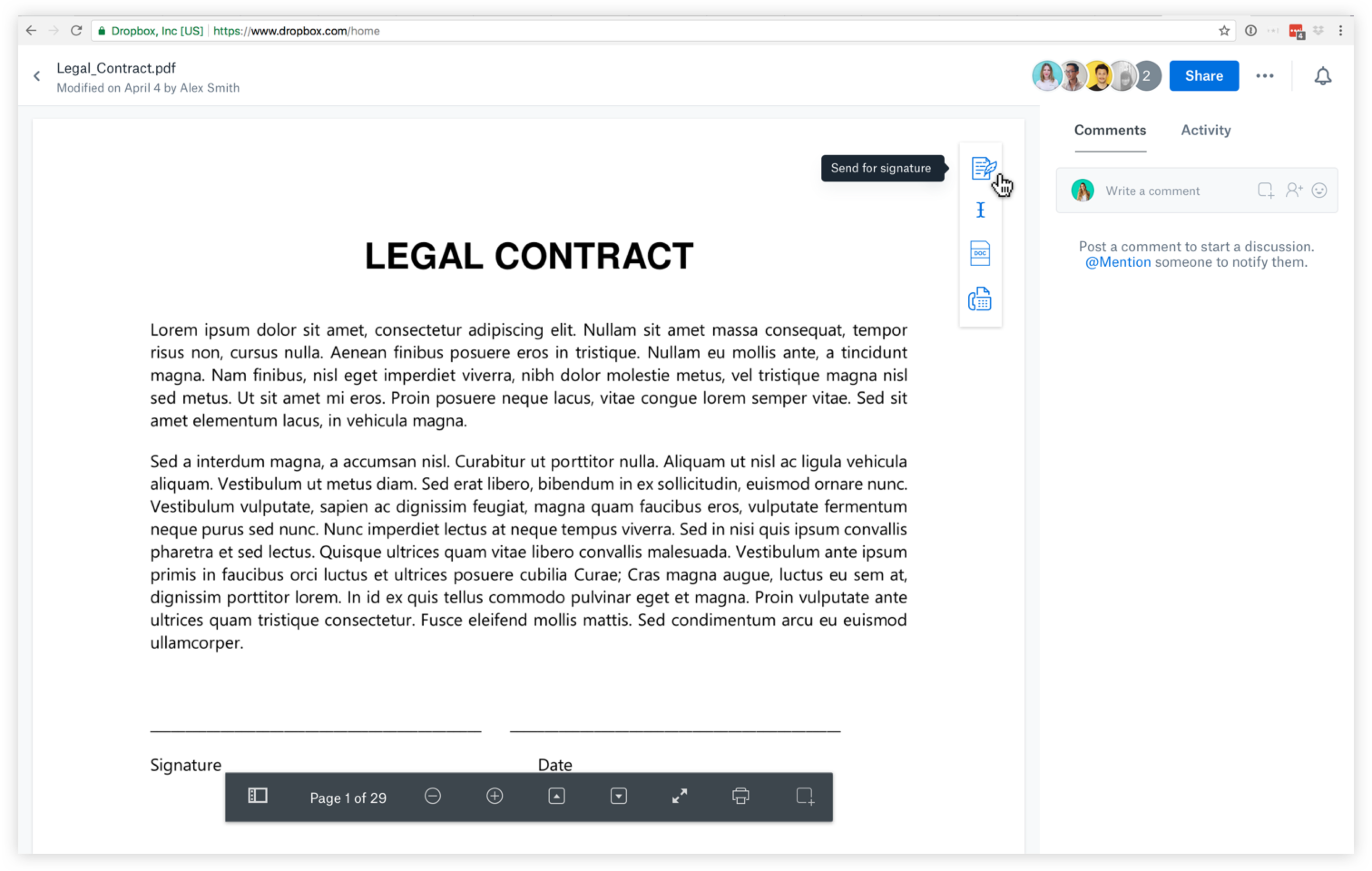
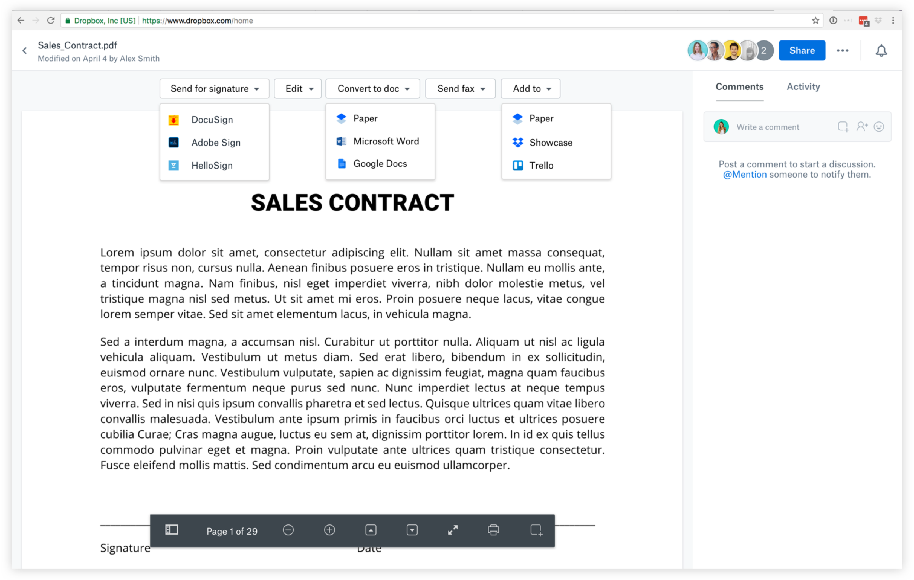
Compiling user feedback
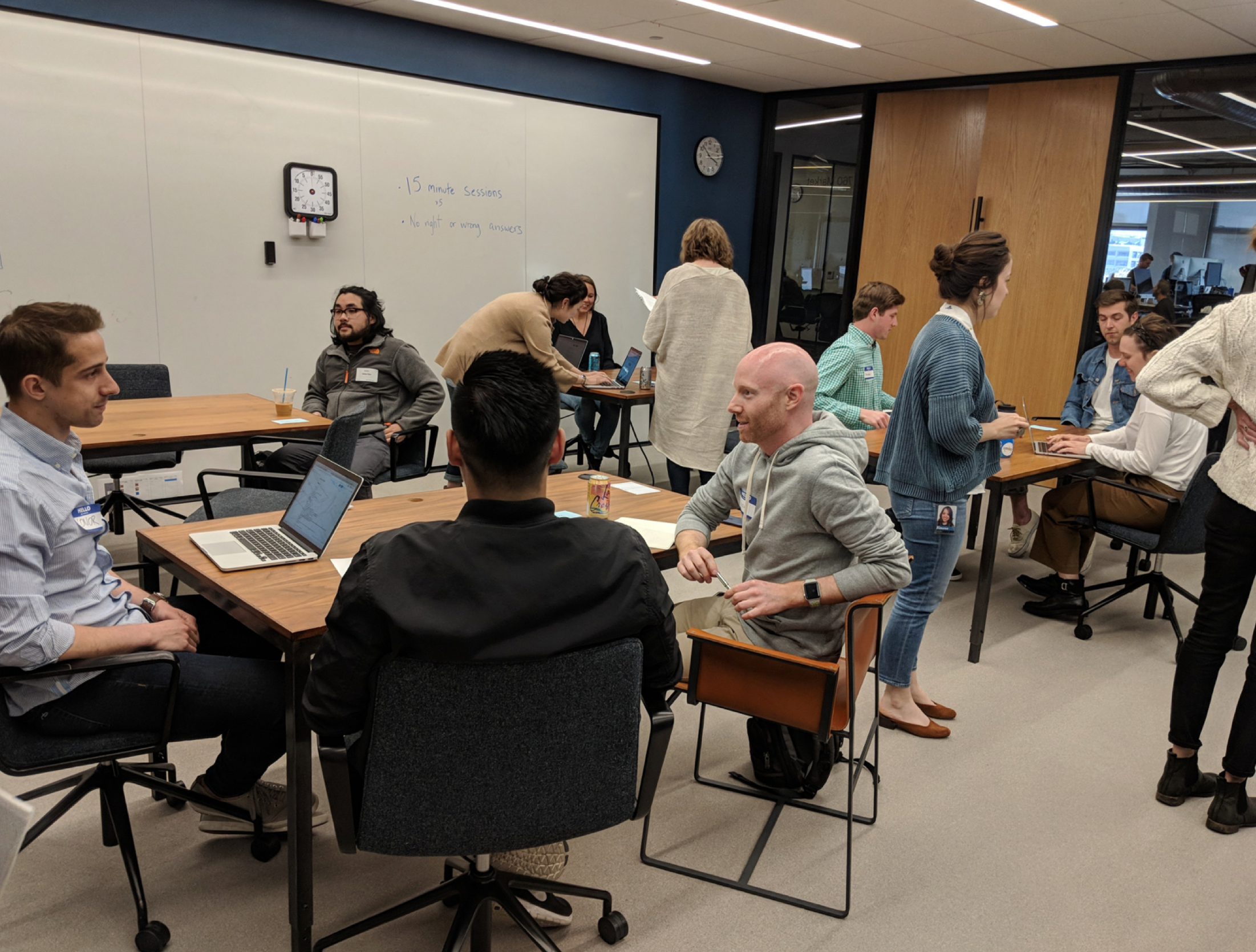
I conducted several usability studies and spoke with 20 participants to understand more around how users think about their tools and the task they need to accomplish.

Distilling to two design directions
We learned that users want to understand the value of a tool so making it clear what category a tool belongs to was important for tool discovery and search.
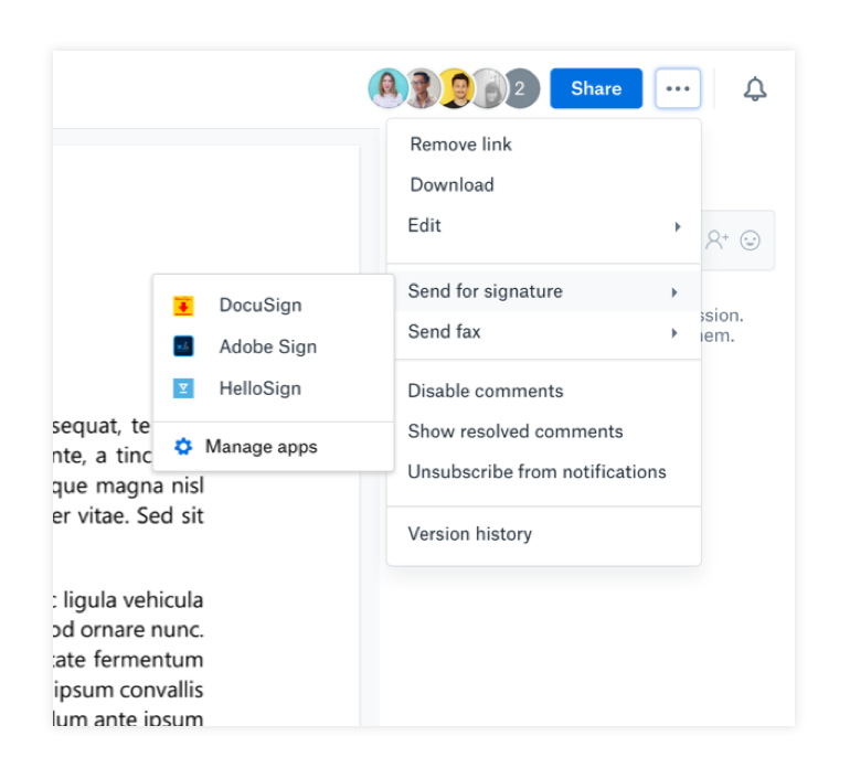
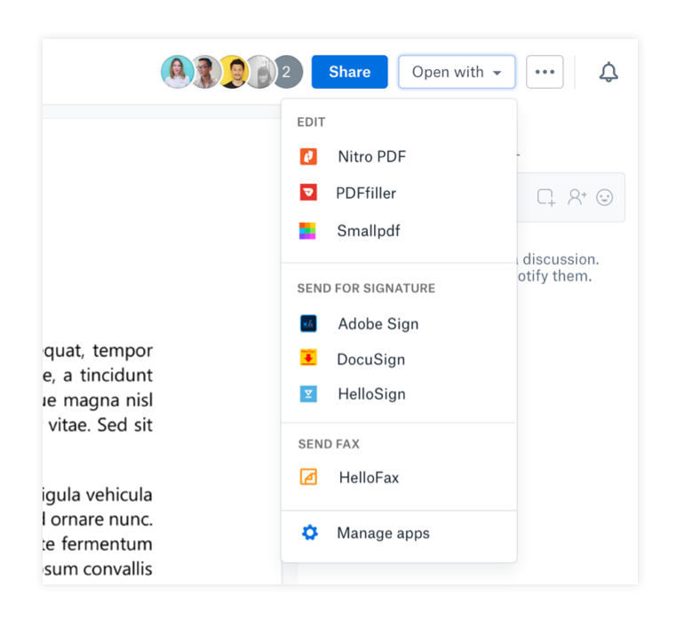
We decided to go down the path of direction 2 for two reasons even though we understood it was not scalable for long term when we grow to become a more sustainable platform.
- We were only launching with a limited set of partners to begin with
- Discoverability for this feature makes more sense when access to 3rd party tools live together especially since this was a 0-1 product launch
Tackling mutual awareness
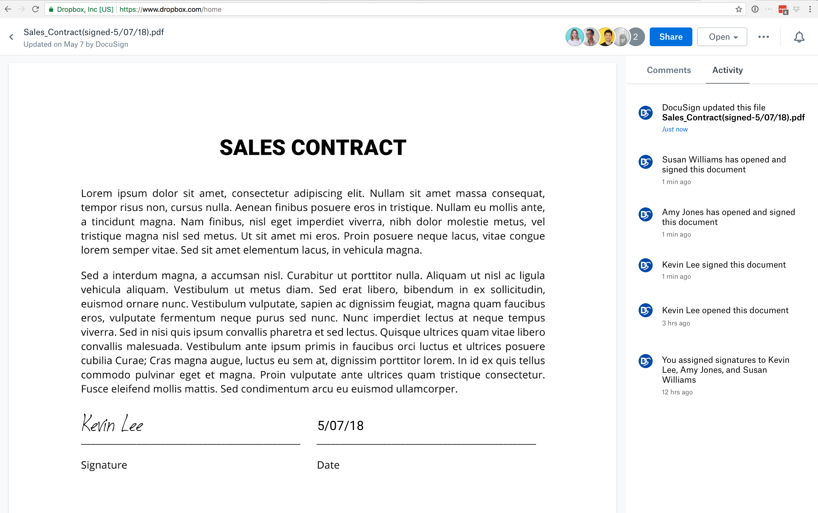
When users hand off work to their collaborators or clients, they are often left in the dark about what is happening with the file after it leaves Dropbox. They frequently run into the problem of constantly emailing or calling to check-in on the status of the work.
Content fragmentation
When users upload files to cloud applications, new copies of these files are commonly duplicated and left in these applications causing the problem of content fragmentation. Content starts to get siloed and are stored in multiple locations with no single source of truth. Users often have to dig through multiple tools before they can retrieve the correct version.
Automatically save files to Dropbox
When users complete their workflow, regardless of the tool they use, we want to automate new files to be saved back directly to their Dropbox, making Dropbox their source of truth and their system of engagement.


Surfacing file status
Research showed that knowing about the status of the file before, during, and after can be super valuable.

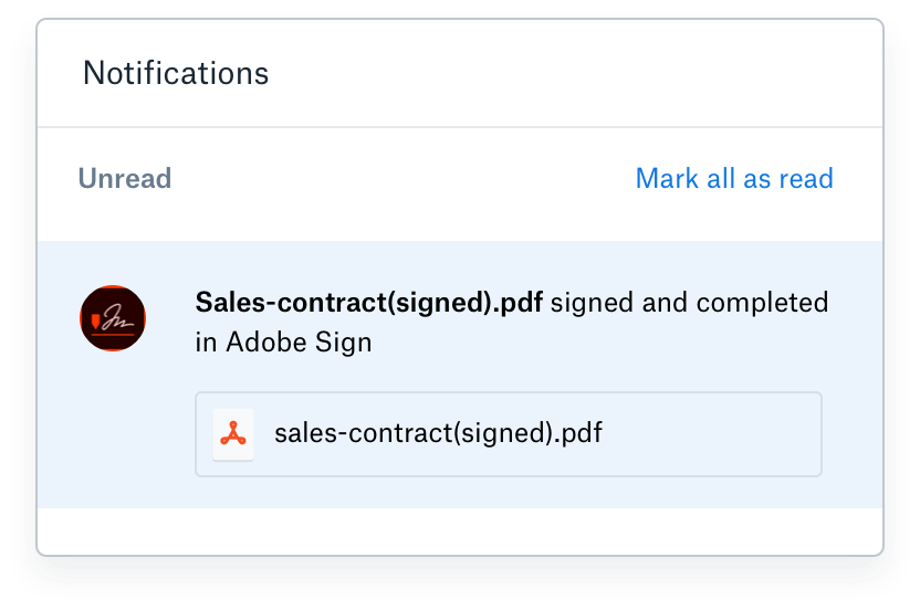
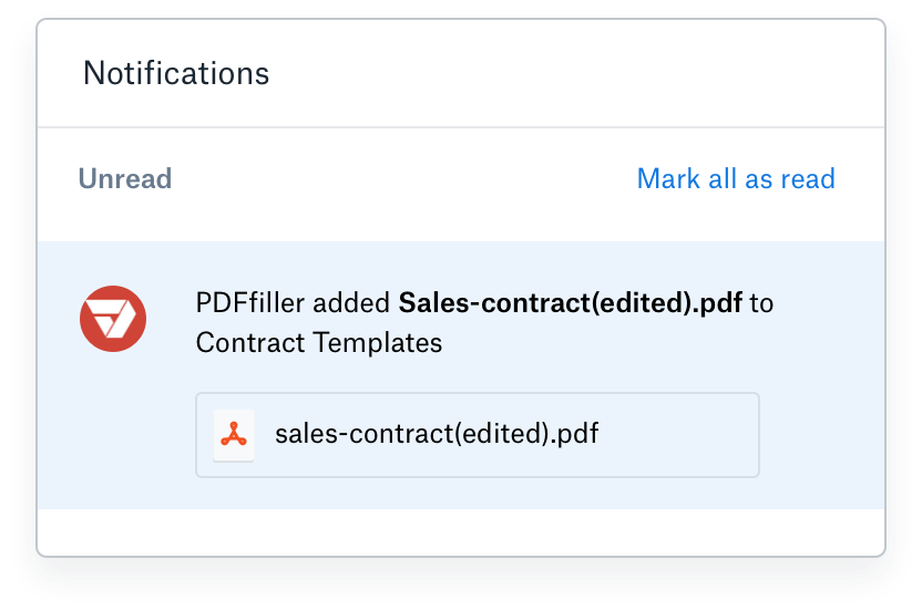
Bringing events happening outside of Dropbox, back to Dropbox
To increase the impact of new file save-backs and activity, I designed the experience to only notify users and their team when important events about their file has happened such as document being signed.
Collaborating with partners
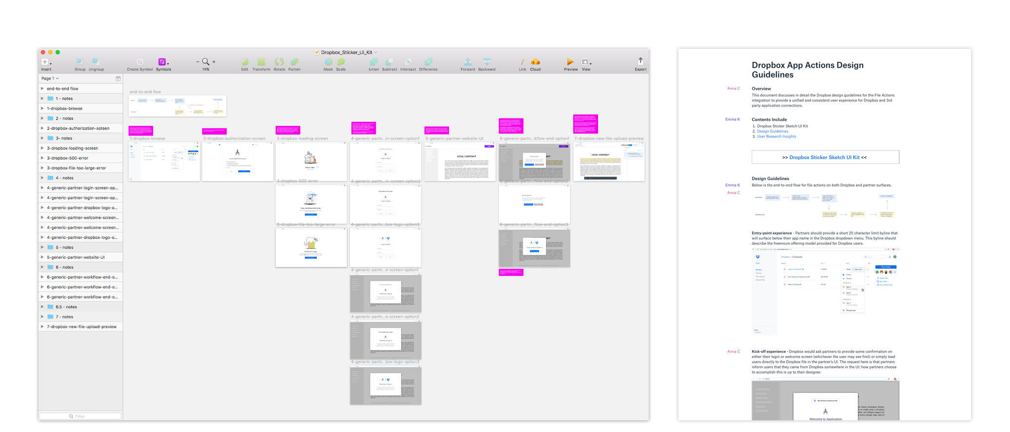
To work closely with our partners, we had to develop a framework for how we would collaborate with all of them, each with a different set of requirements, design, and engineering process. I developed a Dropbox Sketch UI kit and a design guideline documentation that we shared with all partners to provide a consistent user experience for our users.
This is only the beginning
We are only scratching the surface with this design outcome. We only launched on the web as a proof of concept. To increase the scope of impact, the next set of problems we will tackle will include:
- Context-switching (providing contextual actions)
- Meeting where users work (scaling to desktop and mobile)
- Unlocking more workflows (providing more tools)

What does success mean?
- # of workflows completed
- # of linked apps
- % of new traffic to partner apps
Noteables
- Security was a common theme throughout this project. We want to make sure users feel safe when bringing a file outside of Dropbox.
- It was really interesting to understand all the various workflows done with Dropbox such as faxing!
- I learned a lot about different tools and how users use them together.