
Forming the product roadmap and user flows
Working together with product and engineering to understand product goals.
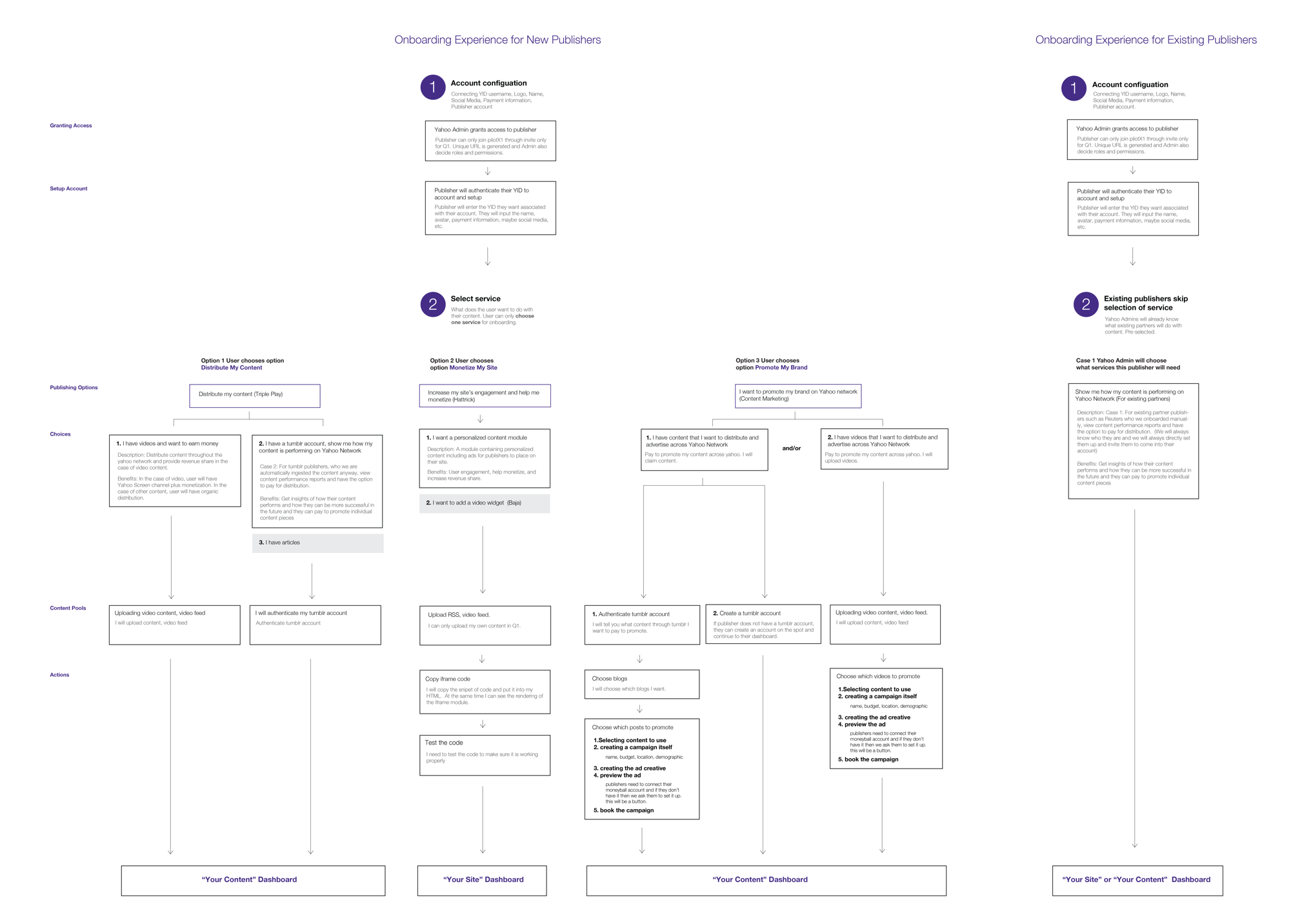
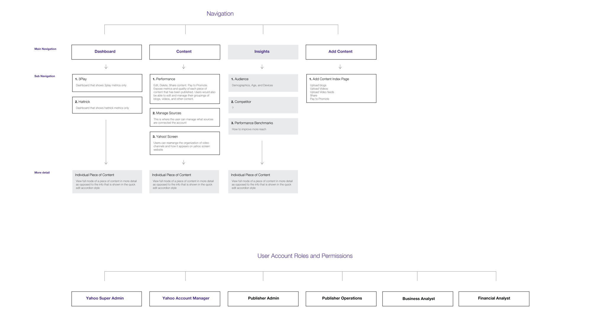
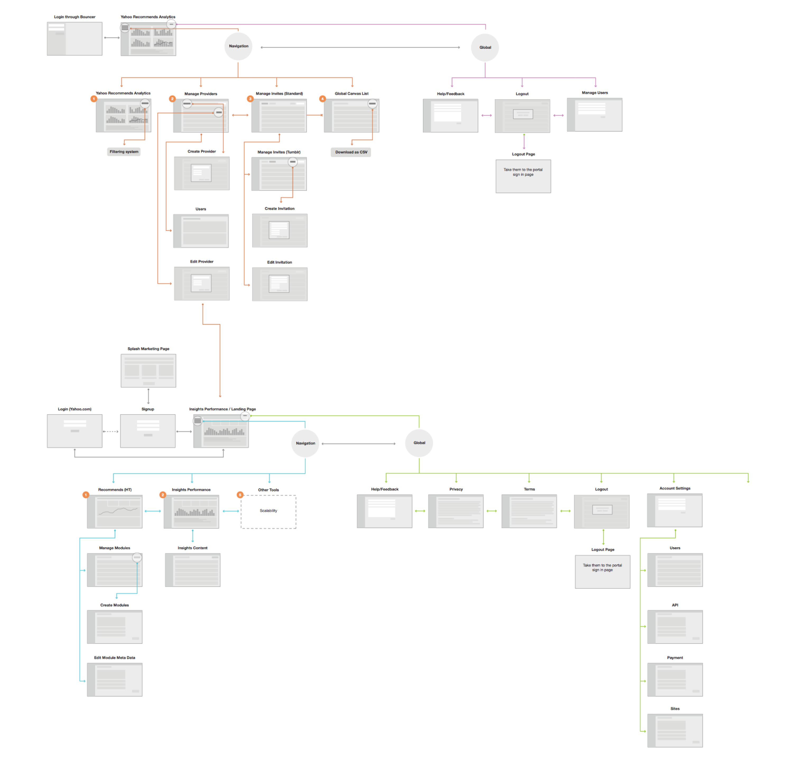
Laying out new product architecture
Figuring out how all of the systems work together.
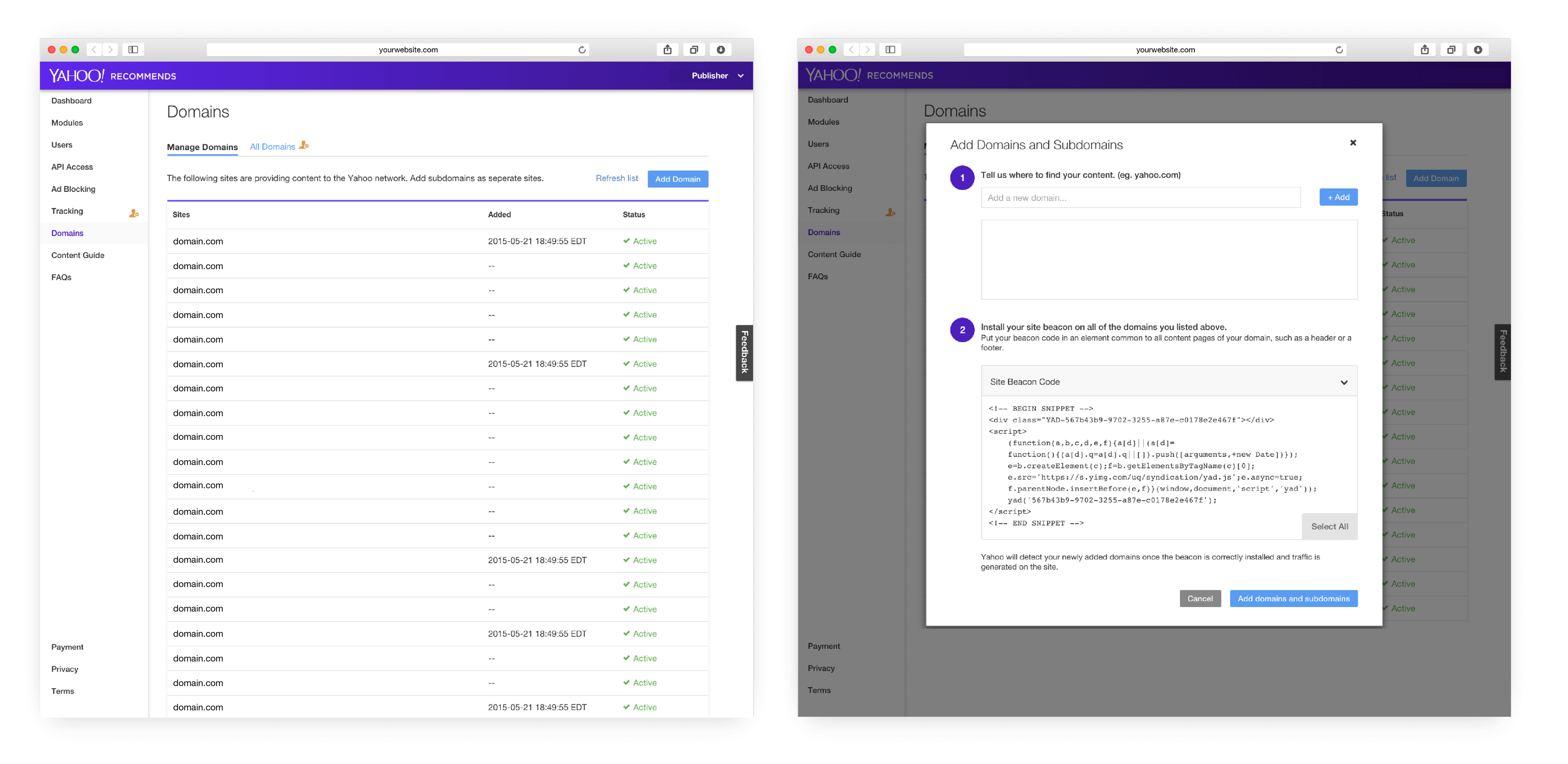
Drawing out different screen scenarios
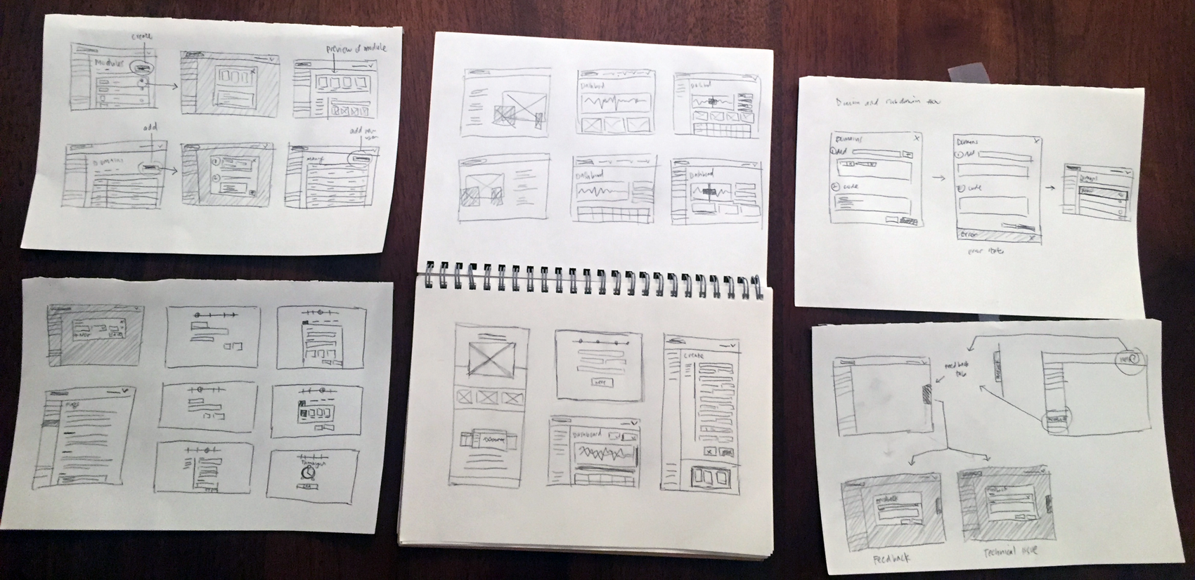
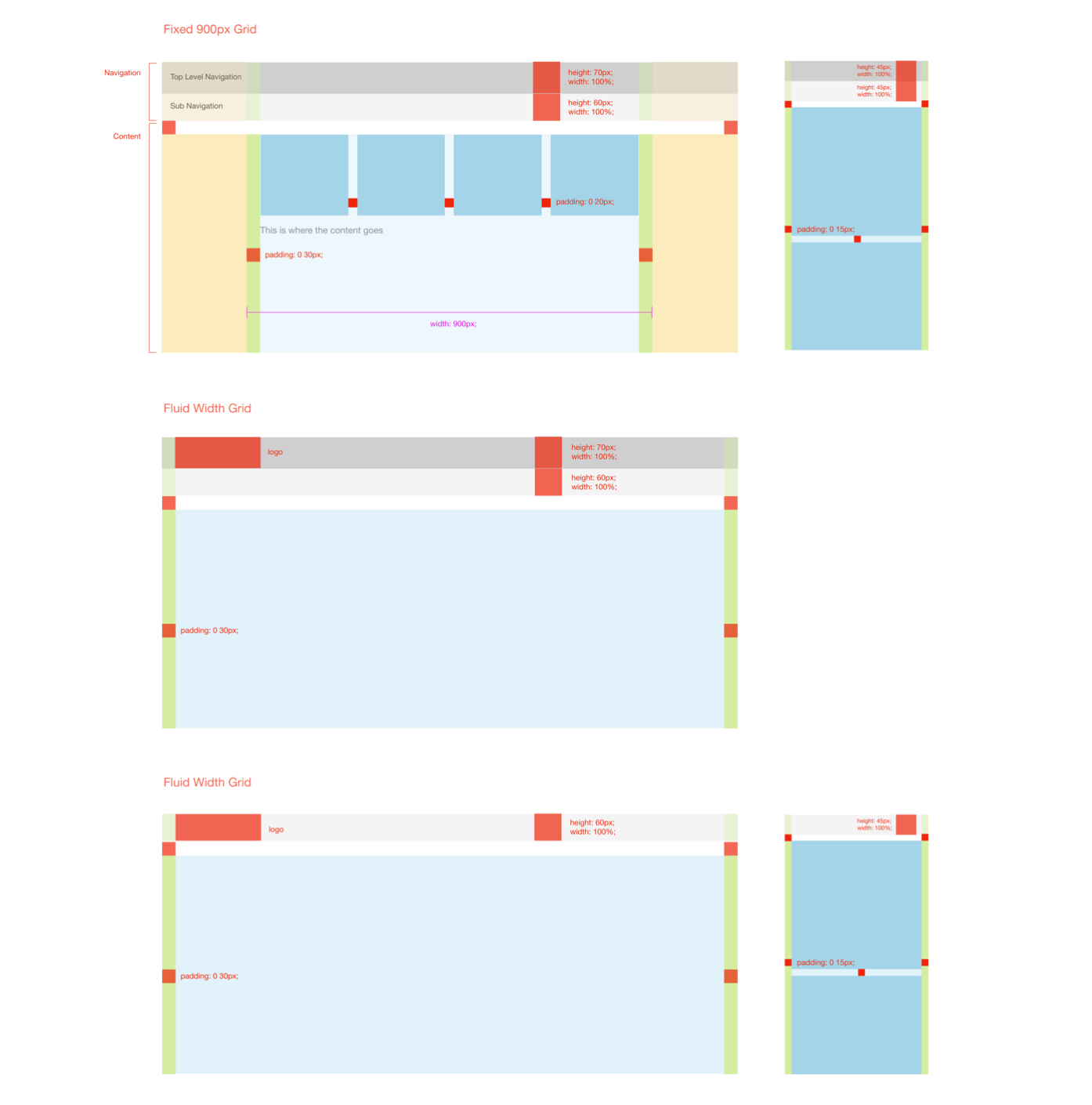
Figuring out where elements are placed
This grid definition was used across the entire Yahoo internal products organization so scalability was necessary.

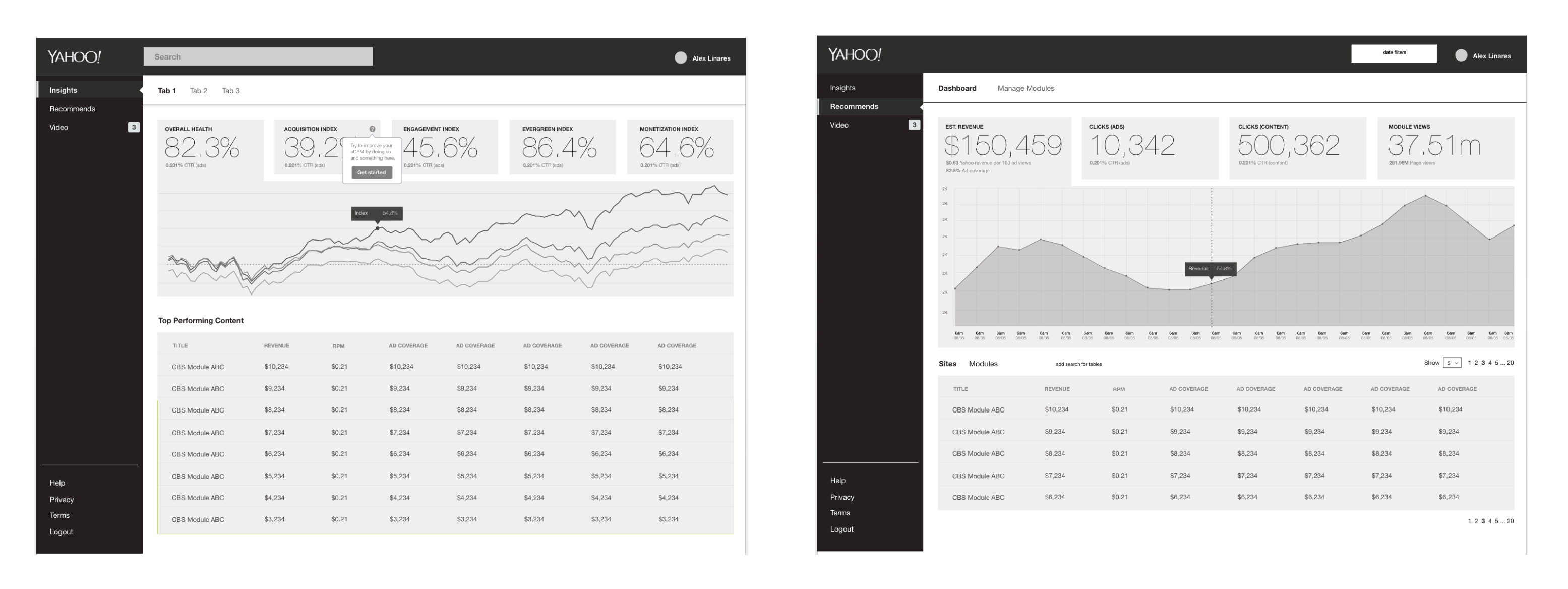
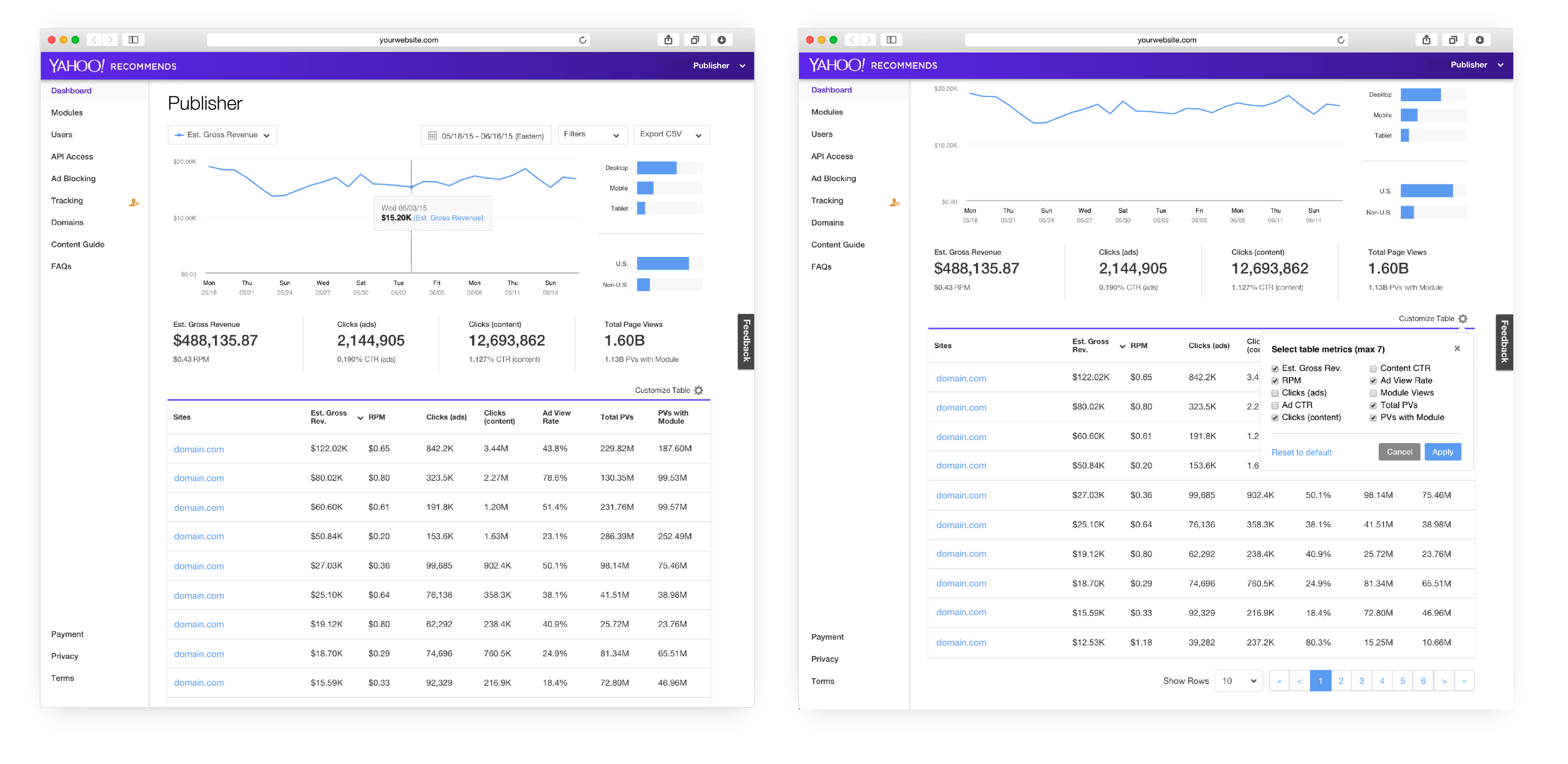
Different dashboard approaches
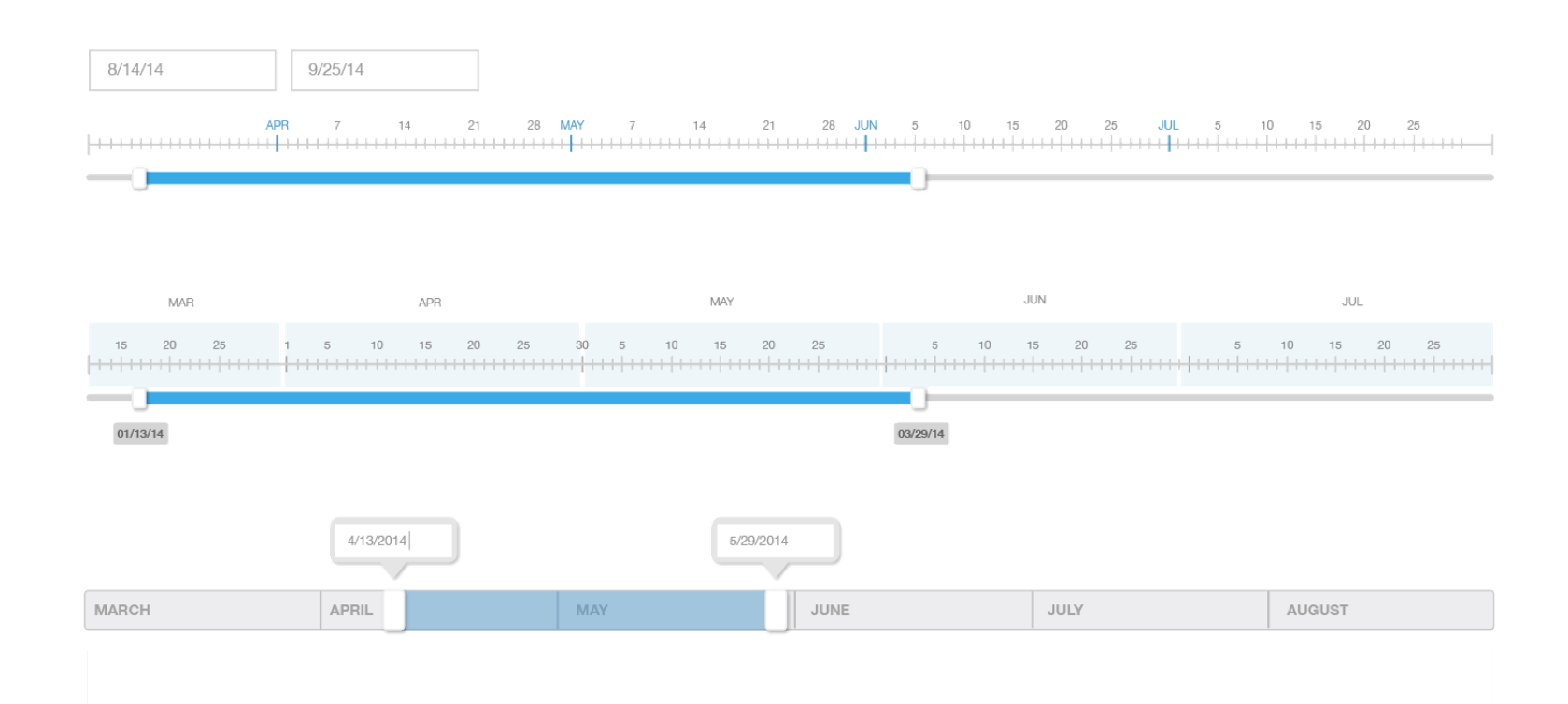
There were several important elements that needed to work together as a system.
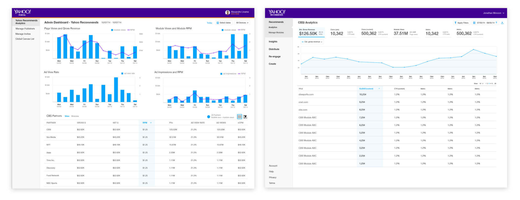
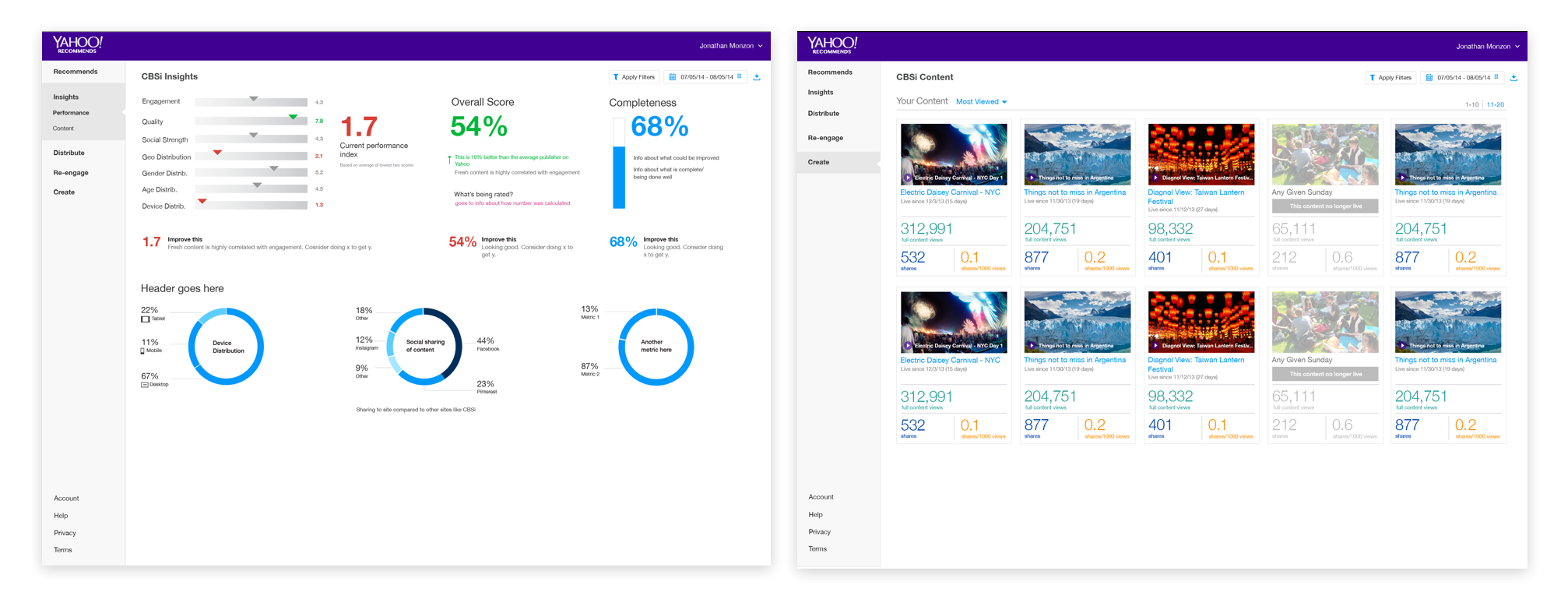
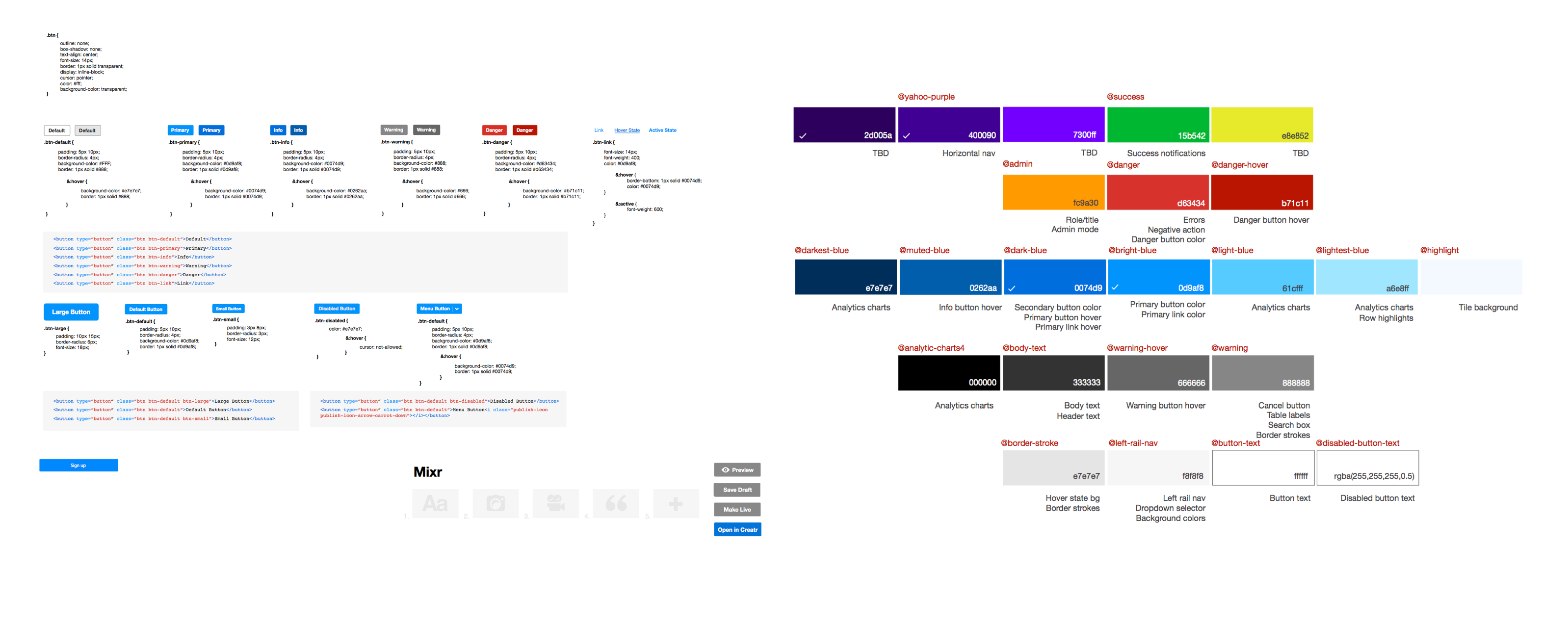
Building a design documentation
Since this was a brand new product, I had the opportunity to build a style guide from the ground up.

User research & Iterating
Problem: Splash page was not clear enough that users were not sure what service we were providing.
Solution: I had added illustrations to show what the actual ad module looked like that would be embedded into their websites.
Problem: Onboarding flow was confusing for user. User did not know which step they were on or how long the onboarding process wuold be.
Solution: I had added clear wizard steps at the top of the site so user was not lost.
Problem: User were unable to continously see a preview of the module they are making when scrolling.
Solution: We added a fixed preview of the module to the bottom of the site that they were able to minimize.
iOS
Desktop
Team

